
A Savings Tracker feature for Capital One’s savings account users, enabling them to set personalized savings goals and track their progress effortlessly.
Add a feature project / UX design / 80 hours / Feb 2025
Problem
Savings account users feel disconnected from their financial progress, as they are unable to visualize how their savings contribute to their saving goals, making it harder to stay motivated and confident in their financial planning.
Context
83%
35%
of Americans have at least one savings account in their name.
have two or more savings accounts. Even upwards of five accounts are held by a small percentage of people.
Resource: GOBankingRates survey
The trend toward holding multiple savings accounts is growing, as financial experts increasingly recommend this strategy to help people budget, organize funds, and build financial stability.
“It’s essential to have at least one savings account. Your primary savings account should be a place to build an emergency fund — which should be everyone’s No. 1 financial priority. Once you hit your emergency fund savings goal, you may want to open another account to save for other goals, especially if you struggle to compartmentalize your money or tend to impulsively dip into savings”
Mark Henry, founder and CEO of Alloy Wealth Management
However, most banking apps lack tools to visualize savings trends or financial growth, leaving users feeling disconnected from their progress. Without clear insights, it becomes harder to stay motivated or track how savings support long-term goals.
Problems with the Capital One Bank App
Managing Multiple Savings Accounts
Capital One encourages users to open multiple savings accounts to categorize their funds. However, users often find themselves manually transferring money between accounts to stay organized. This process is tedious, requires constant monitoring, and increases the risk of mismanaging funds. Without an integrated way to categorize savings within a single account, users experience unnecessary friction in maintaining financial organization.
No Interest Earnings Visibility
While Capital One promotes its high-yield savings account, users often overlook the interest they’ve earned because the app does not prominently display this information. Without clear visibility, users miss out on the motivation and financial awareness that seeing their earned interest could provide.
Lack of Savings History Insights
Users must dig through statements or the activity page to track their savings trends. The data is presented in a dull, transactional format that lacks meaningful insights or visual representation. Without an engaging way to view progress, users struggle to stay motivated and make informed financial decisions.
Solution
I developed a Savings Tracker feature that enables users to organize their savings into virtual buckets, set clear savings goals with simple steps, track interest earnings, and visualize their savings trends—creating a more engaging, intuitive, and personalized financial experience within a single account.
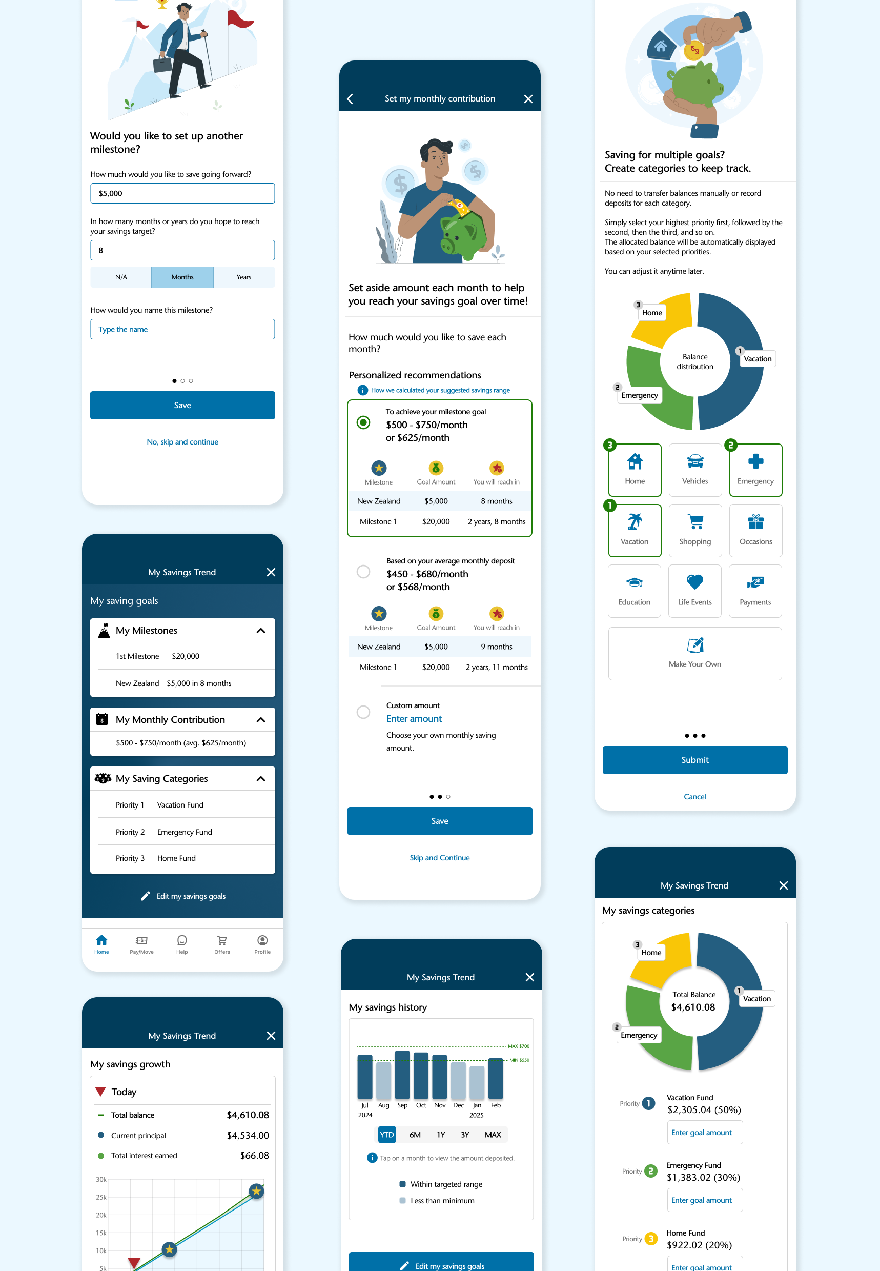
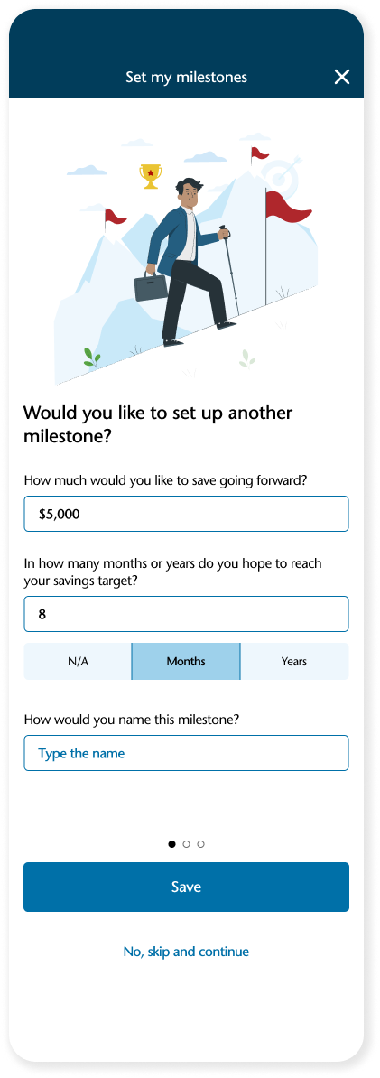
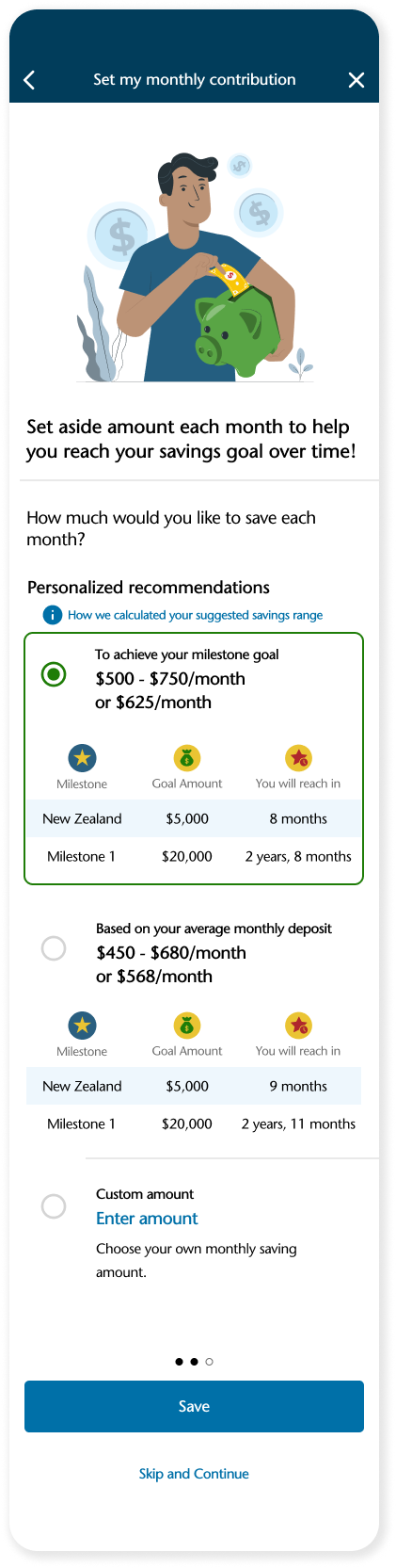
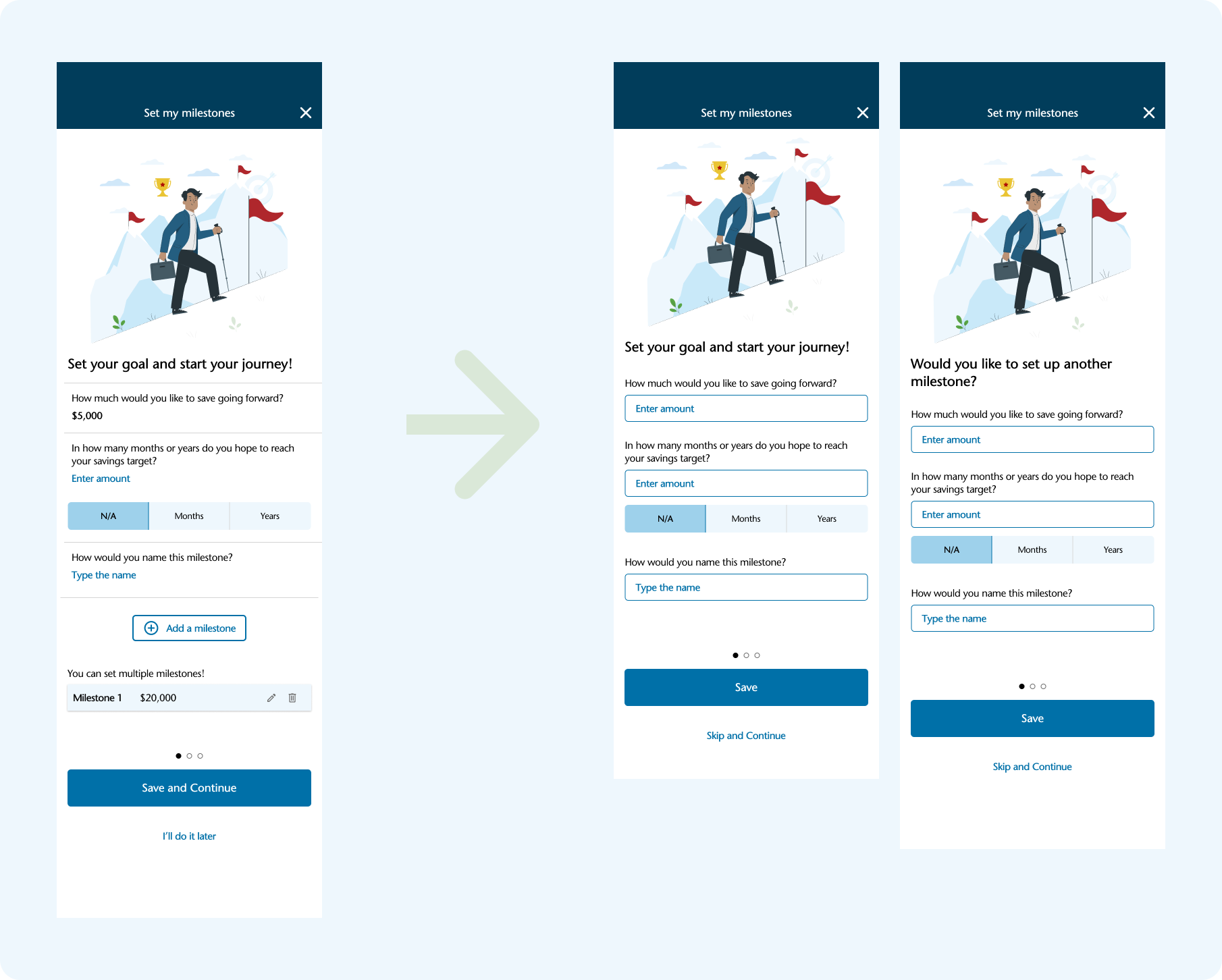
Simplified Savings Goal Setting
To reduce friction and increase engagement, I introduced a three-part goal-setting flow:
Set My Milestones – Users define the total amount they want to save, name their milestone, and set a target timeframe.
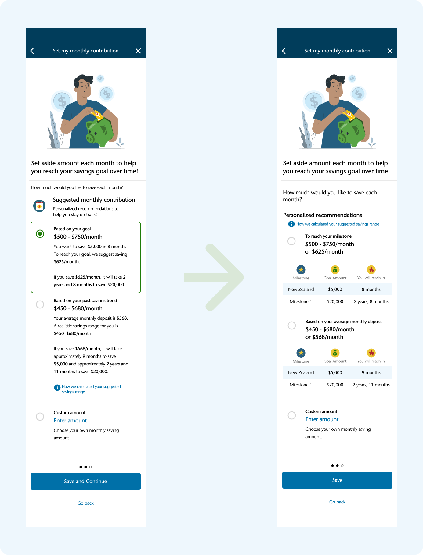
Set Monthly Contribution – Users select a suggested monthly savings amount, with a flexible range based on their timeline.
Set My Categories – Users organize their savings into named categories, aligning their goals with their personal priorities.
These three steps reflect user needs uncovered during research: the desire for motivation, clarity, and an effortless way to track financial goals. By guiding users through a simple, structured process, the app encourages deeper connection and ownership over their financial habits.
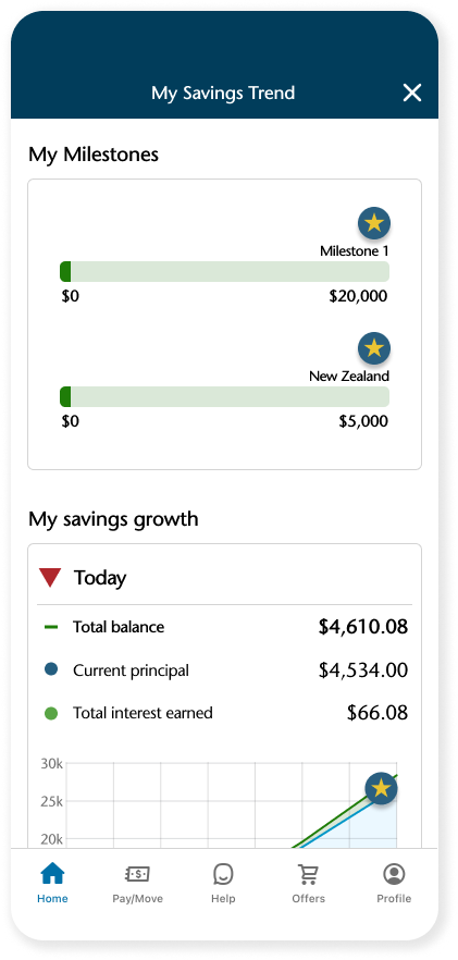
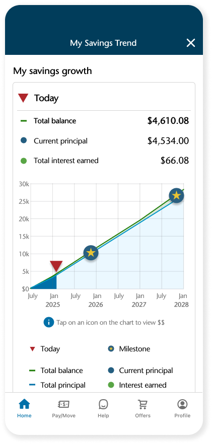
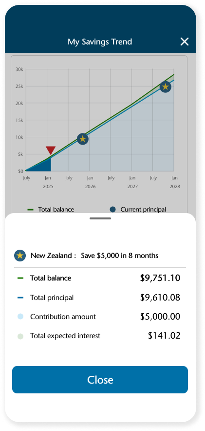
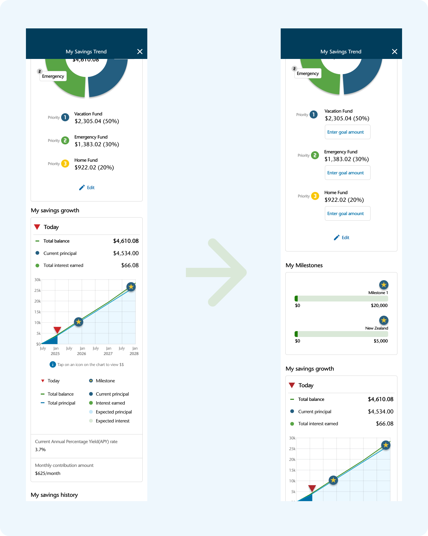
Progress Trackers with Milestones
To support long-term motivation, I designed two visual tools:
A milestone progress tracker that shows how close users are to reaching each goal.
A financial projection graph that illustrates how their savings could grow over time.
These visualizations help users clearly see their current progress and future potential, building confidence and encouraging consistent saving.
Comprehensive View of Financial Goals
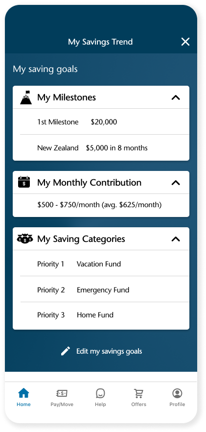
After completing the goal-setting flow, users are presented with a clear overview of all their customized savings goals in one place. Users can edit or update these goals at any time, allowing flexibility as their needs change.
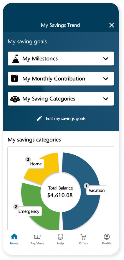
Savings Tracker with Categorization
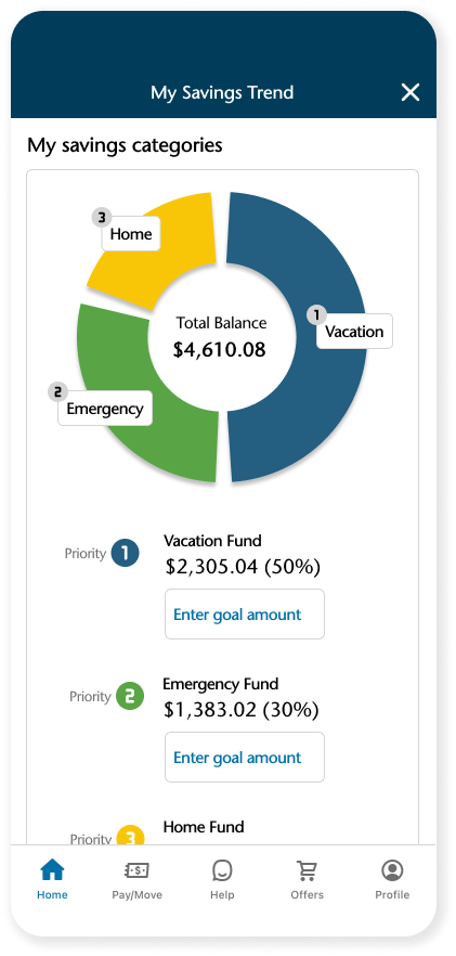
The first section on the My Savings Trend dashboard is My Savings Categories—the feature users said they wanted to see first during usability testing.
To meet this need, I introduced an automatic virtual bucket system within a single account, eliminating the need to open multiple savings accounts. Users simply set priorities for their savings categories (e.g., vacation, emergency fund, home), and the system automatically allocates funds using weighted percentages based on those priorities.
✔️ No manual transfers. No complex calculations.
This automation makes savings easier to manage while still giving users a clear sense of structure and control.
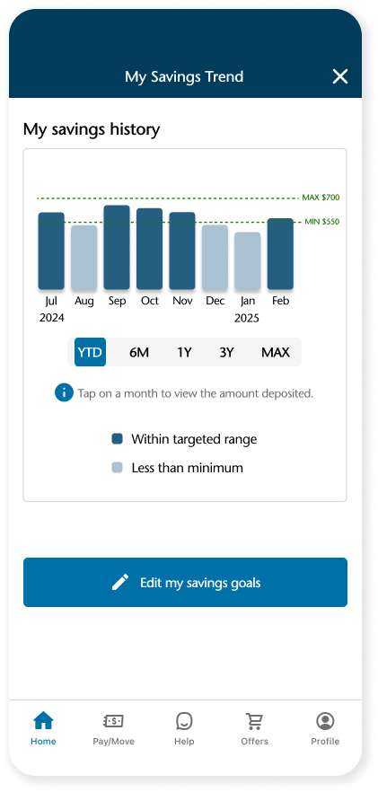
Visual Savings History Insights
I designed an interactive savings history chart that clearly visualizes monthly deposit activity. This eliminates the need to manually review statements by providing data-driven insights in an easy-to-understand, engaging format. By making savings behavior more transparent, users can effortlessly track their financial habits, stay motivated, and make more informed financial decisions.
Process
Research
Competitor analysis
Two rounds of 1:1 User interviews
Define
Persona
Sitemap
User flow
Design & Testing
Lo-fi, Hi-fi, Prototype
Usability Testing
Research
Discovery of a key gap: while users want to feel more connected to their savings through goal organization and progress tracking, existing tools are fragmented and overly manual.
Competitive Analysis
To better understand the current landscape of savings management tools, I conducted a competitive analysis of leading banking apps and financial platforms. I evaluated how they support users in managing savings accounts and setting savings goals. While most apps allow users to open multiple savings accounts or create savings goals, I found that these features often lack integration, automation, and meaningful visual feedback. These gaps revealed a strong opportunity to design an intuitive, engaging, and personalized Savings Trend Tracker feature.
User Interviews
Second Round of Research
Focusing on Goal-Based Saving and Categorization

I conducted two rounds of user interviews with five participants for each round to deeply understand users’ saving behaviors, goals, and challenges when using banking apps.
First Round of Research
Understanding General Savings Behavior
Key Insights
Users regularly deposit leftover funds into savings accounts after covering expenses.
Their motivation is to prepare for future big expenses while earning interest.
Users with consistent savings habits monitored spending regularly but rarely reviewed saving and its growth, leaving them unmotivated and disconnected from their financial progress.
Tracking savings and interest requires too many steps, causing disconnection and decreased motivation.
Key Insights
Users want to allocate funds to specific goals for better structure and control.
The manual process of managing multiple accounts or adjusting buckets is time-consuming and frustrating.
Users need a simpler, automated way to prioritize and organize their savings.

These two research phases helped me clearly define the user problem: users want to feel more connected to their savings by seeing progress and organizing their goals, but existing banking tools are fragmented and require too much manual effort. This insight led directly to the development of the Savings Trend Tracker feature, combining automation, visualization, and goal-based savings in a single, seamless experience.
Define
User Persona
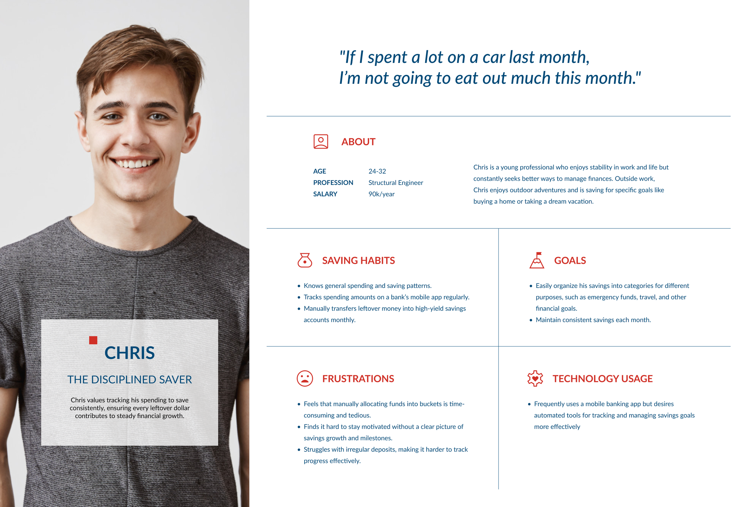
Chris represents a common yet underserved group of banking app users: goal-driven savers who are consistent in habit but lack clarity and emotional connection to their savings journey. Through user research, I found that many users like Chris deposit money regularly but don’t actively monitor their savings growth or progress toward specific goals.
They often rely on multiple accounts or manual methods to stay organized, which can feel disjointed and time-consuming.
Designing for Chris allowed me to address the needs of real users who are already engaged with saving but need better tools to stay motivated, organized, and in control.
Project Goals

Addressing user needs for clarity, motivation, and ease of use would encourage regular deposits and deeper user engagement. This directly supports business goals to increase product engagement, retain customers, attract users to additional financial products, and ultimately maximize profits by enhancing the value of the app and helping Capital One outperform competitors through a more user-centered savings experience.
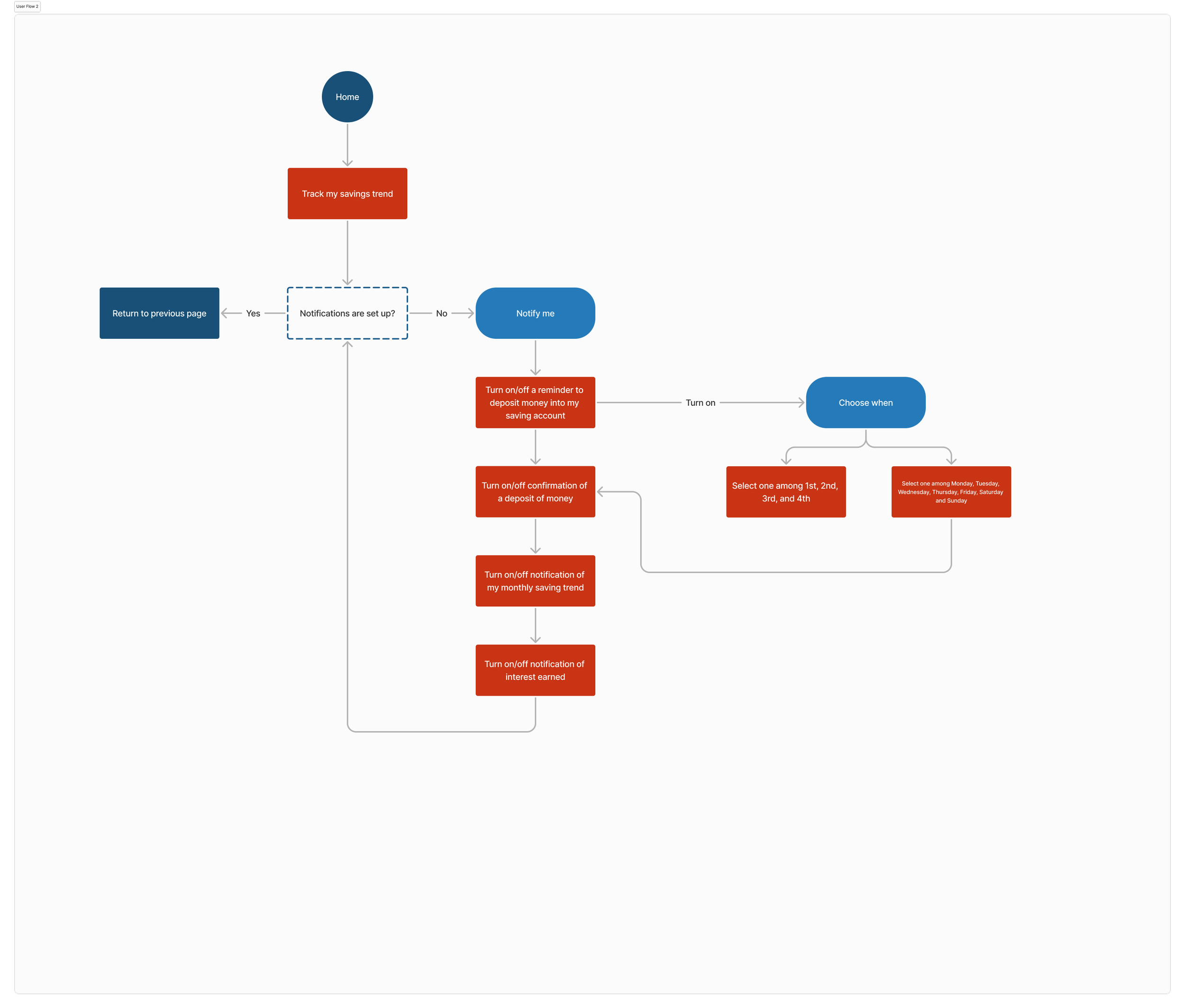
User Flow

Design
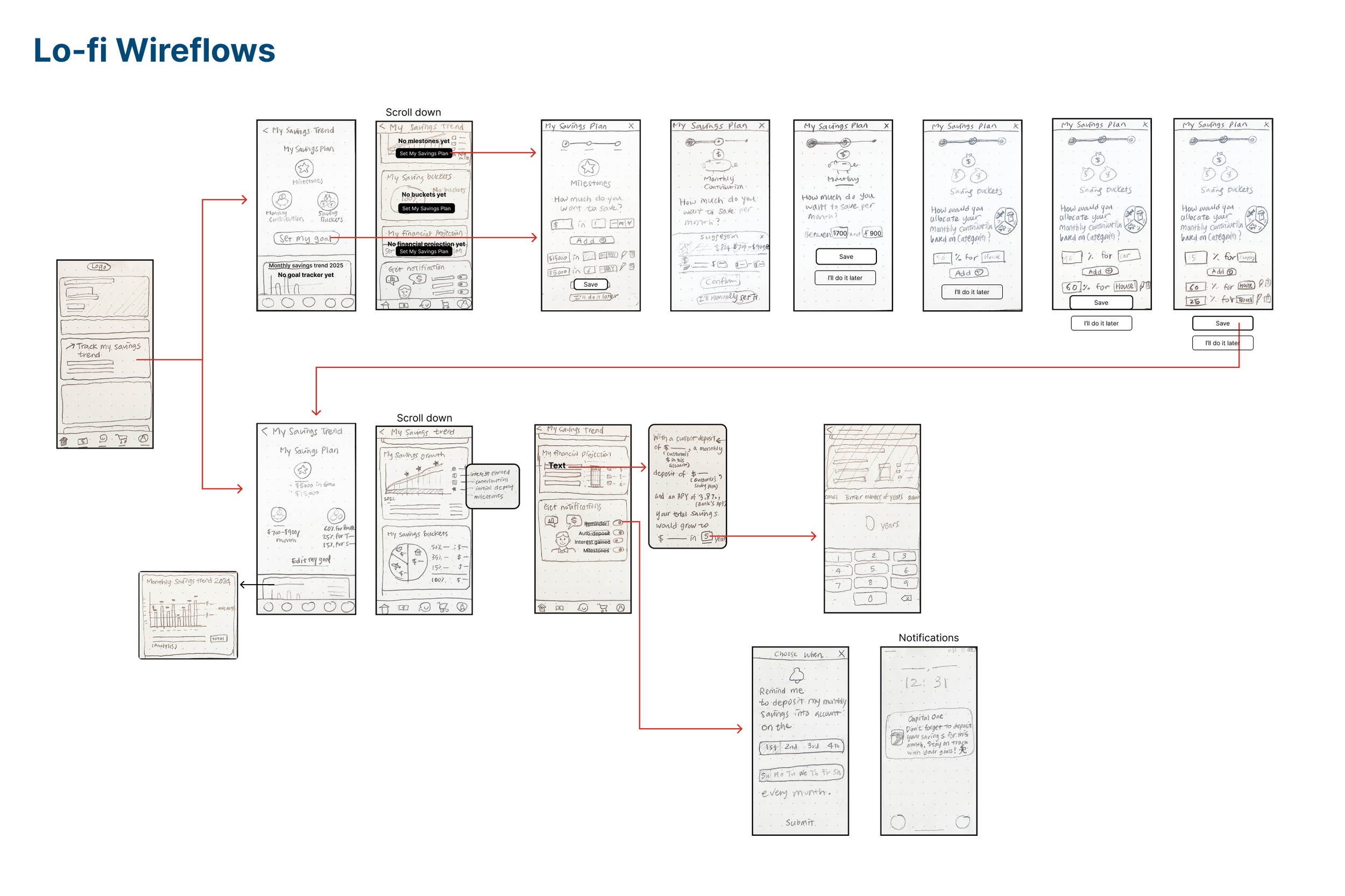
I conducted moderated usability testing of hand drawn low-fidelity wireframes to evaluate its usability and gather feedback for improvement. Using in-person and remote sessions with think-aloud protocols, participants navigated through hand-drawn wireframes.
Users appreciated the visual graphs and saw the feature as motivating for savings, but struggled with the My Savings Plan input flow—particularly around monthly contributions, milestones, and saving buckets. Users requested clearer instructions, better visual hierarchy (e.g., upfront pie charts), and more intuitive navigation.
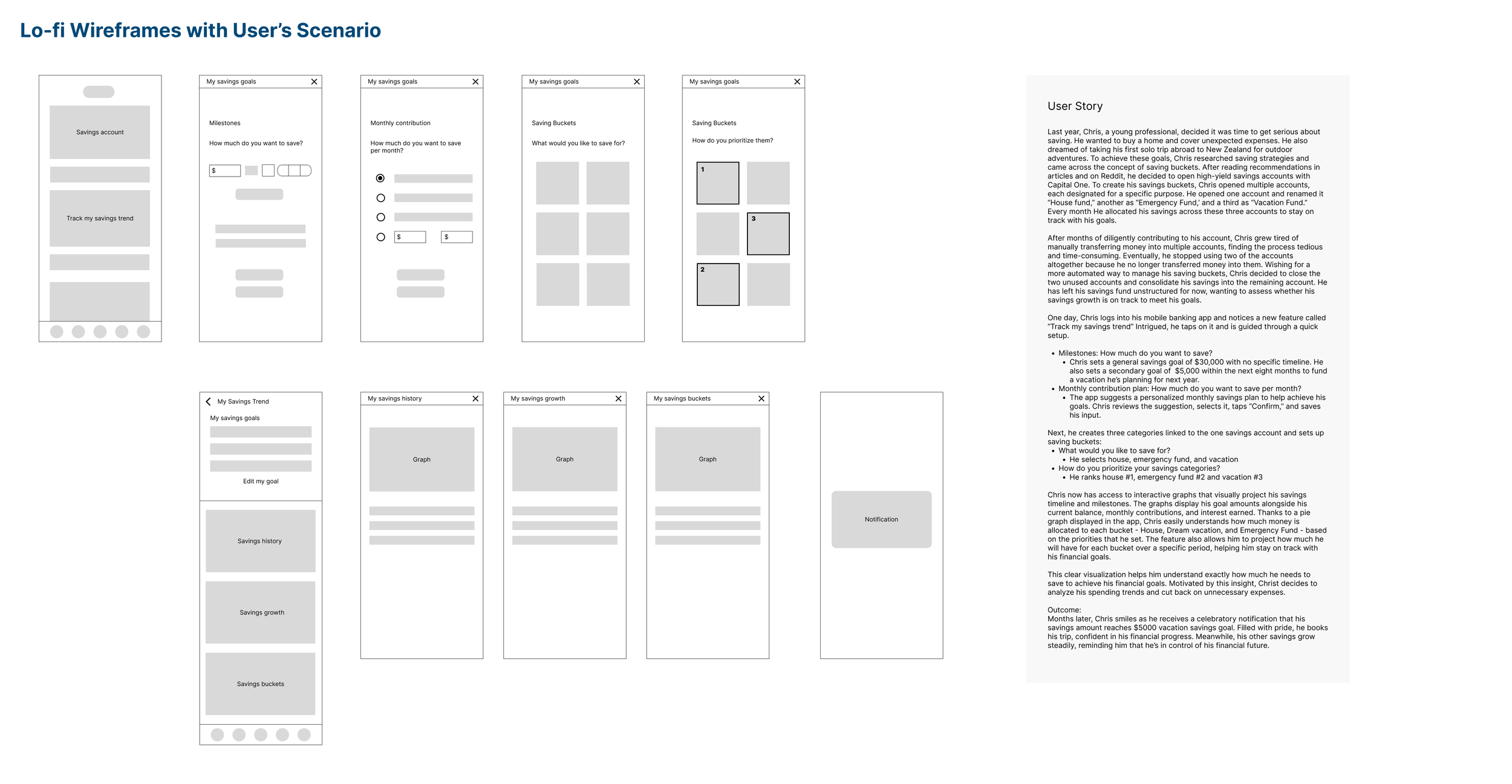
Based on the usability testing findings, I revised the low-fidelity wireframes to improve clarity, navigation, and visual hierarchy. I also developed a user scenario to illustrate how a user would interact with the feature from start to finish. This helped ensure that the revised design addressed real user behaviors and pain points while aligning the feature with a more intuitive, goal-oriented journey. These updates laid the foundation for a more user-centered and cohesive experience before moving into high-fidelity design.
Branding
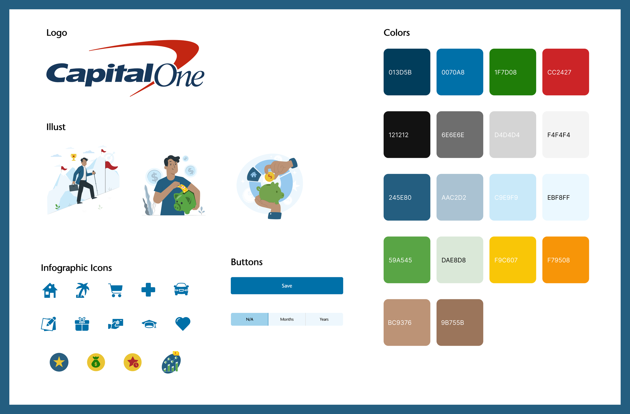
To ensure visual consistency and brand alignment, I implemented Capital One’s design system throughout the high-fidelity mockups. I focused on maintaining clarity and readability by using clean typography, an intuitive layout, and consistent iconography. To align with the app’s existing aesthetic, I customized colors for images and icons based on Capital One’s color palette and created matching infographic-style icons that visually support key content without overwhelming the interface. This approach helped reinforce trust, familiarity, and a seamless integration of the new feature within the existing product ecosystem.
Hi-fidelity Prototype
Testing & Iteration
To evaluate the intuitiveness and efficiency of the high-fidelity prototype, I conducted remote usability testing using video conferencing, screen sharing, and a think-aloud protocol. The test focused on key tasks: setting a savings goal and viewing savings trends.
Findings revealed confusion around the multi-step milestone process, difficulty distinguishing between milestones and savings categories, and a need for clearer account linking. Users also felt overwhelmed by text and requested more visual guidance and information icons.
Conclusion
Summary
The Savings Trend Tracker helps users set savings goals, organize funds into categories, and visualize progress—all within one account. By combining automation, visual feedback, and goal tracking, it transforms saving into a more engaging and rewarding experience. The feature was closely shaped by user research and testing, resulting in a solution that feels both intuitive and impactful.
Key Takeaways
I can confidently design within existing product ecosystems, ensuring seamless integration.
I know how to conduct user research, synthesize findings, and translate them into practical design decisions.
I value simplicity and clarity—reducing friction and improving user satisfaction through thoughtful interaction and visual design.
I’m comfortable balancing user needs and business goals to create features that drive both engagement and product value.
Next Step
Exploring notification and reminder features to support habit formation
Incorporating micro-interactions to reinforce positive user behavior
Testing the high-fidelity prototype with a broader group for further validation