Redesigning KimlyParc to tell a stronger brand story and boost user confidence
UX/UI Design / 75 hours / March 2025
Problem
Users couldn’t quickly grasp what made KimlyParc coffee special, leaving them unsure about its quality, ingredients, and why it was worth buying.
Project Context
KimlyParc is a premium instant coffee brand rooted in Korean coffee culture. The original website lacked clear storytelling, product differentiation, and intuitive navigation, making it hard for users to understand the brand’s value.

Original website
Solution
Redesigned KimlyParc’s website to clearly communicate its premium, health-conscious instant coffee through intuitive navigation, compelling product storytelling, and a clean, responsive layout optimized for mobile users. I also created a branded email newsletter template to ensure a consistent user experience across marketing channels—boosting clarity, trust, and conversion.

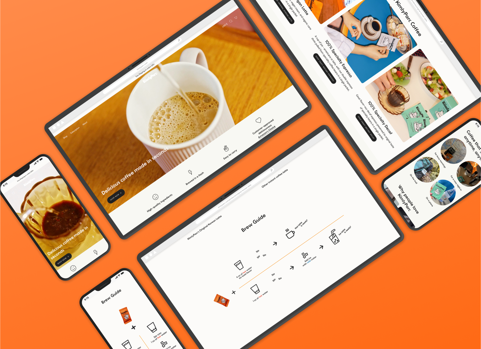
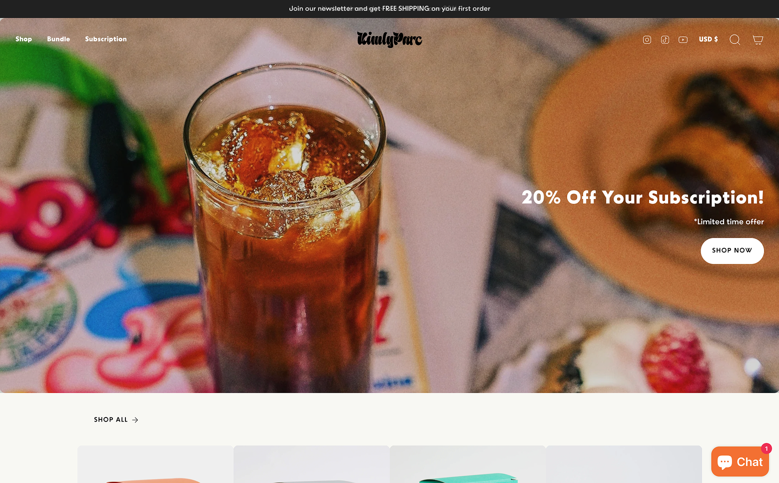
Landing Page (North Star Page)

Landing Page (North Star Page)
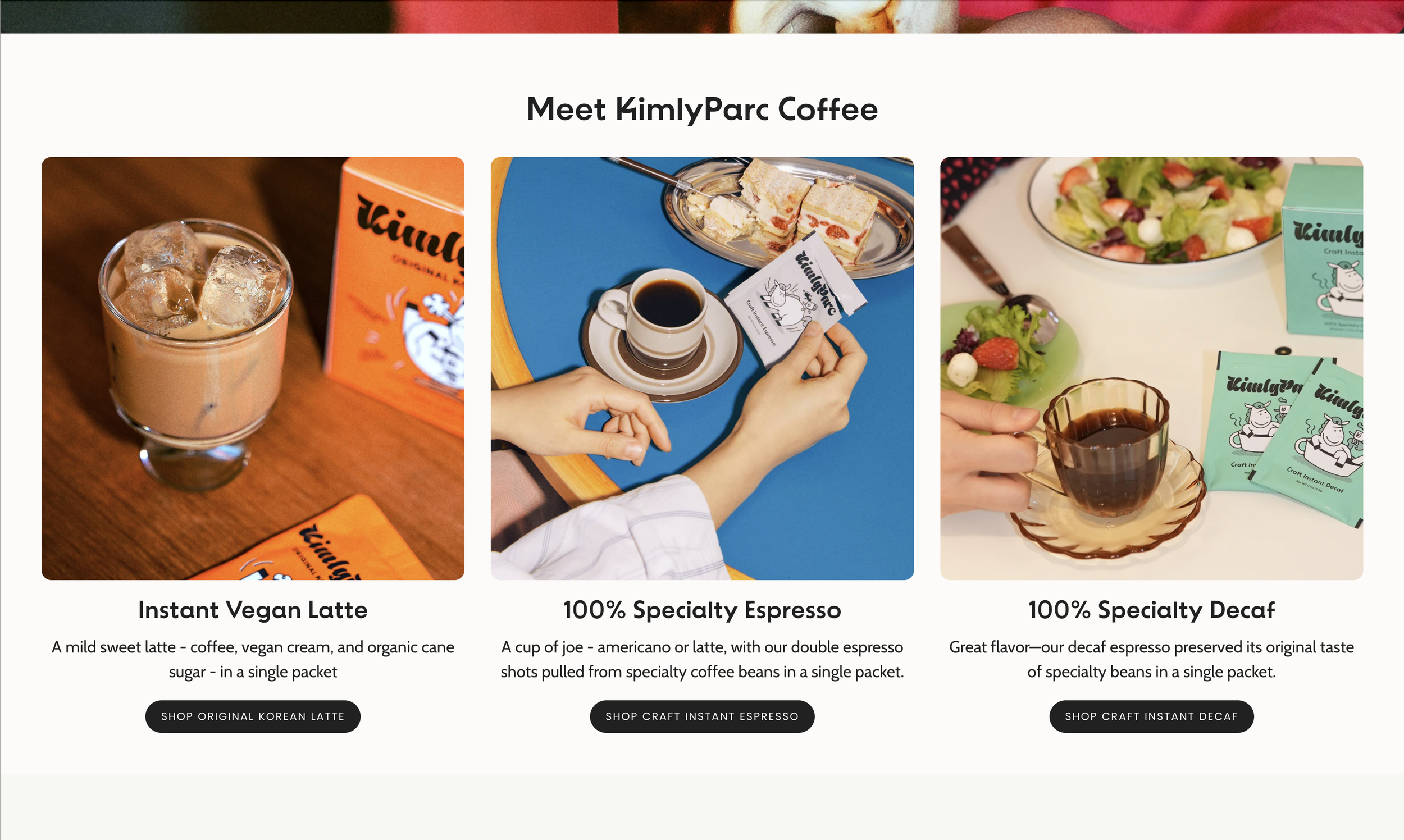
Landing Page (North Star Page)
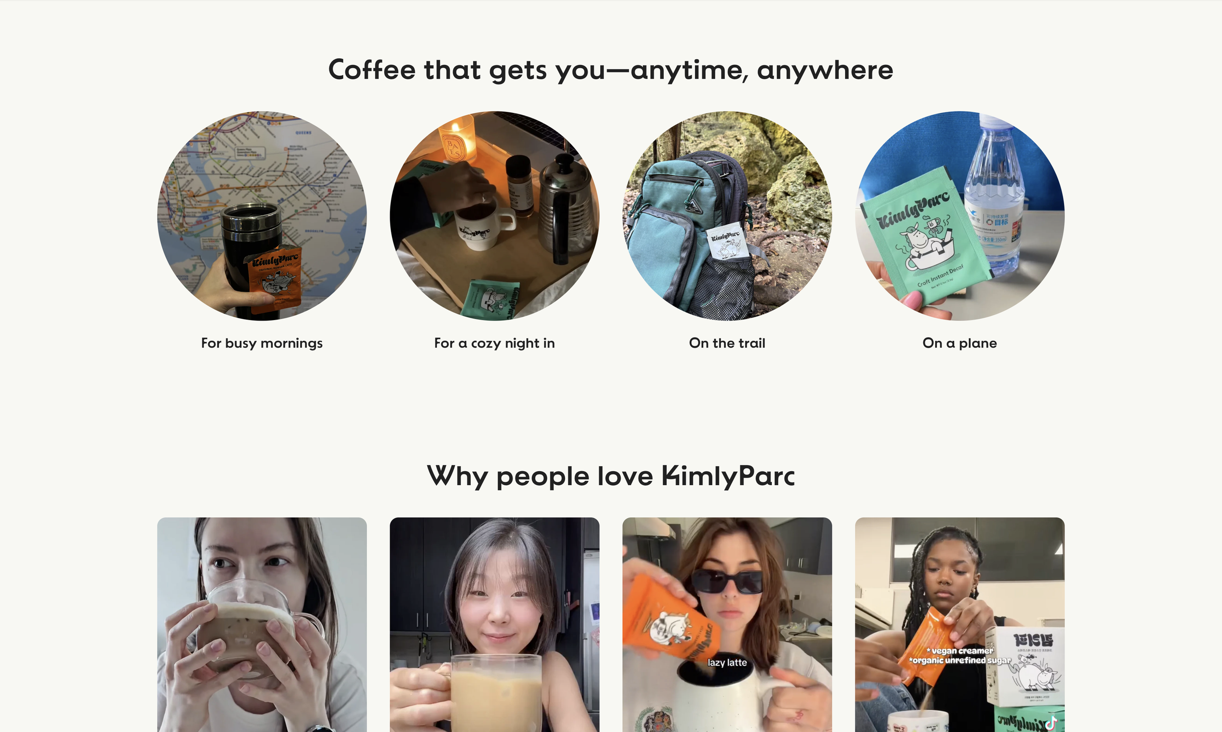
Landing Page (North Star Page)
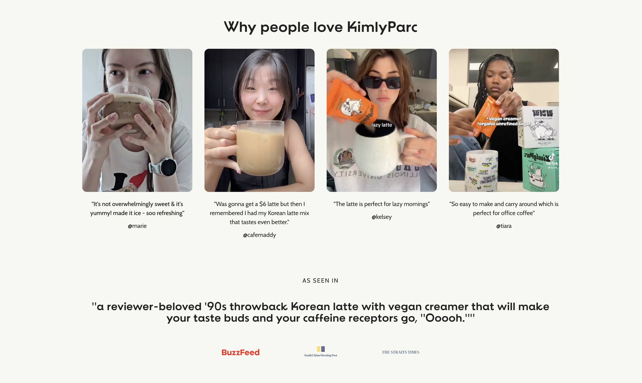
Landing Page (North Star Page)
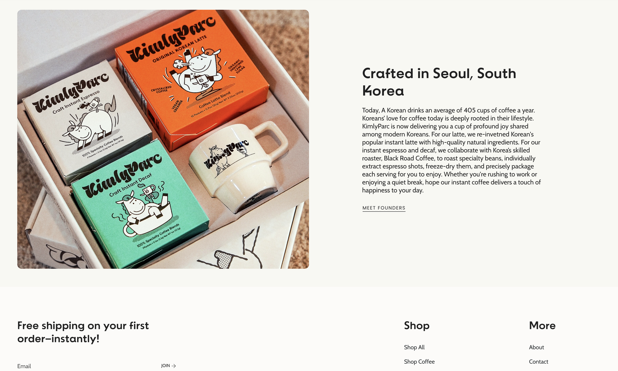
Landing Page (North Star Page)
Designed as the core storytelling hub, the landing page clearly highlights KimlyParc’s brand strengths—premium ingredients, convenience, high customer ratings, trustworthy media exposure, and the recognition of Amazon’s Choice. It also emphasizes the brand’s Korean originality. All three core products are introduced with quick-glance benefits, leading users into deeper exploration. Strong visual hierarchy and strategically placed CTAs are used to drive engagement and conversion from the first scroll.
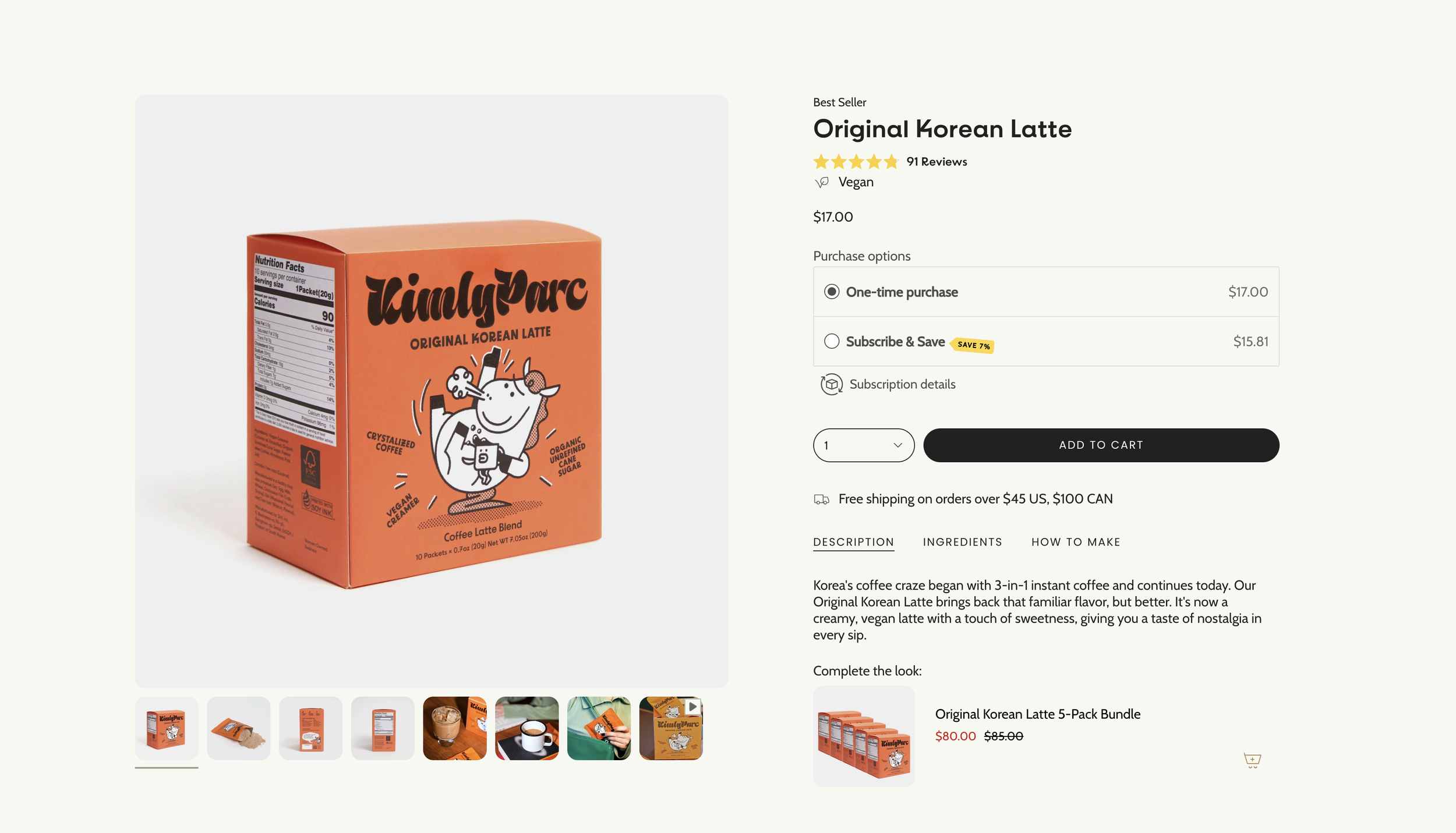
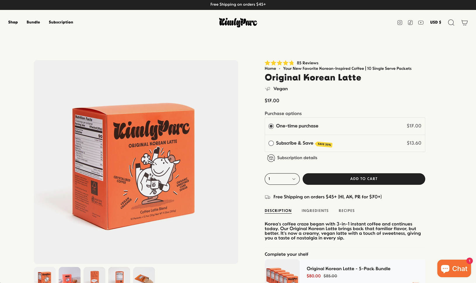
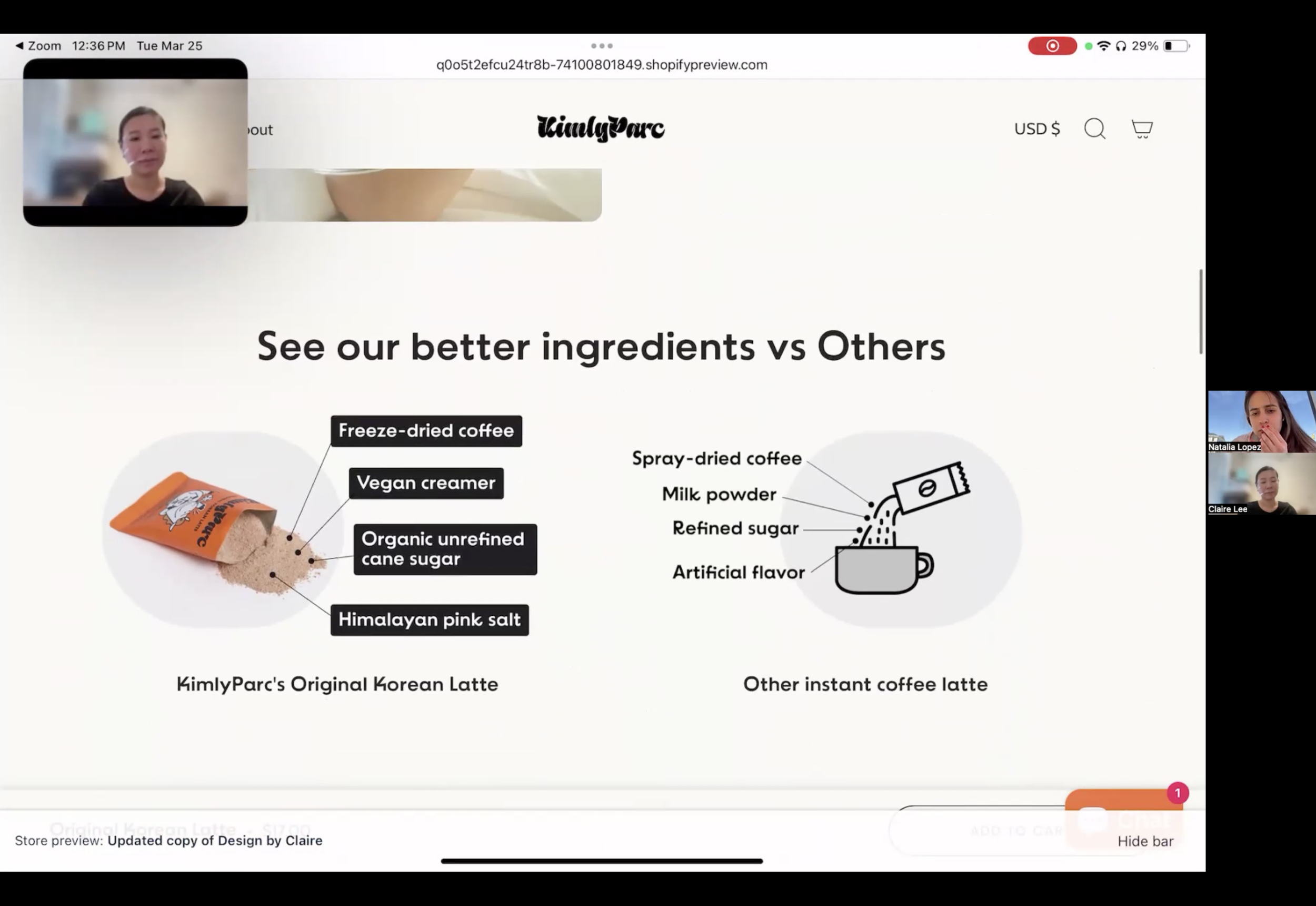
Original Korean Latte Page

Original Korean Latte Page
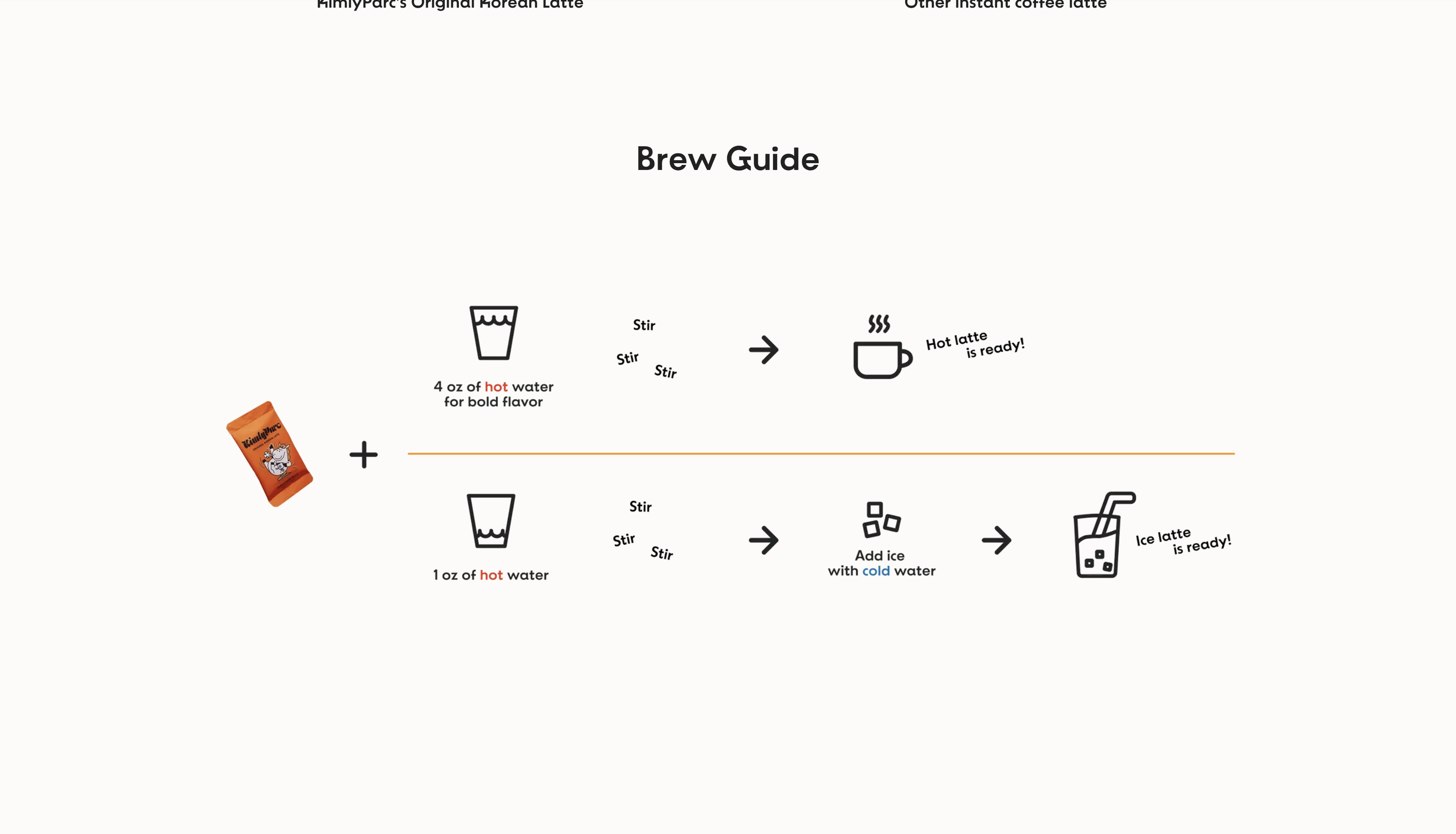
Original Korean Latte Page
Original Korean Latte Page
This product page highlights the latte’s rich taste, premium, natural vegan ingredients, and easy preparation. Visually engaging version of comparison infographics positions the product favorably against other instant options. To emphasize authenticity, the page also links to the story behind Korea’s iconic “mix coffee,” now reimagined as a clean, modern beverage.
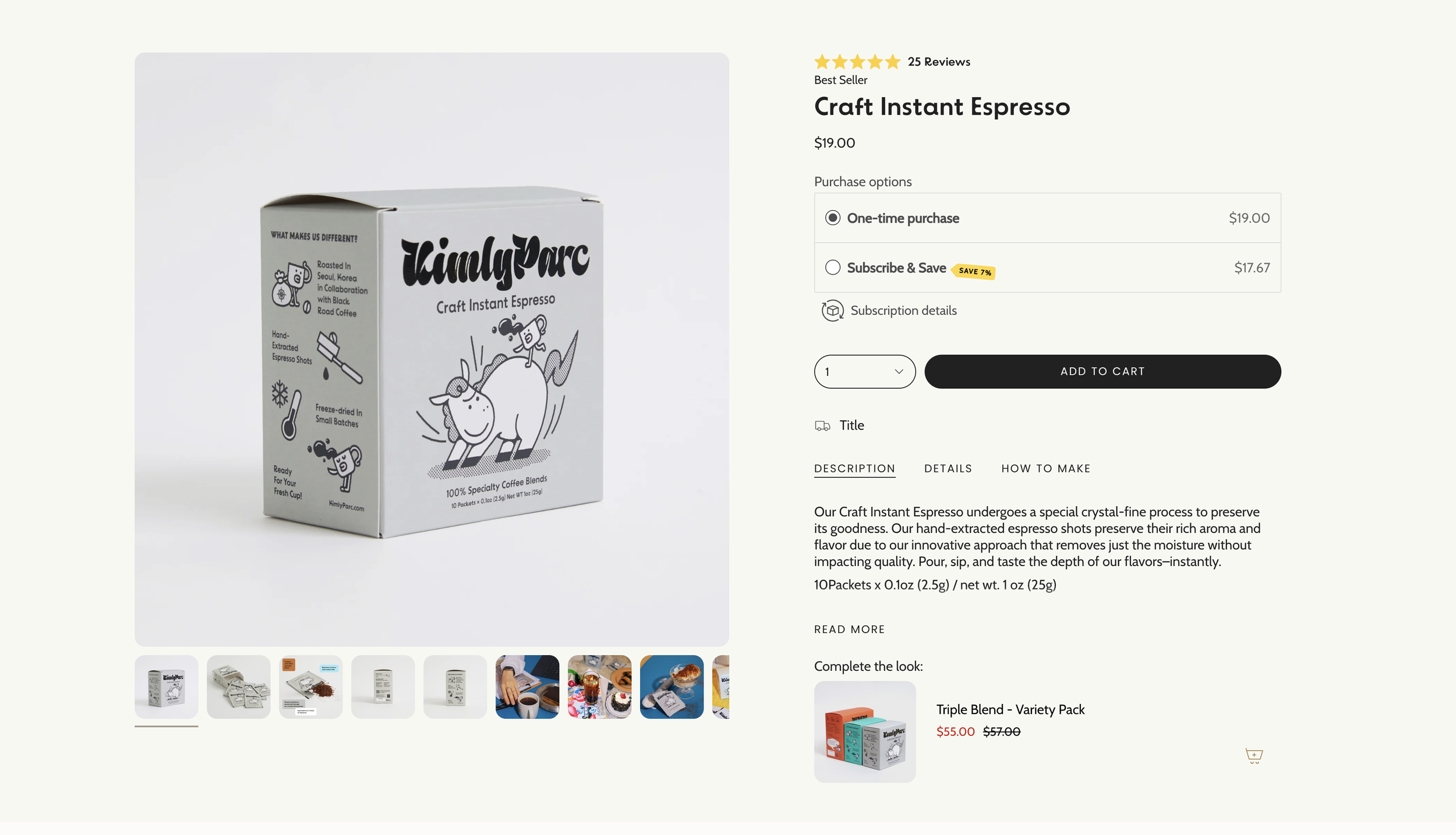
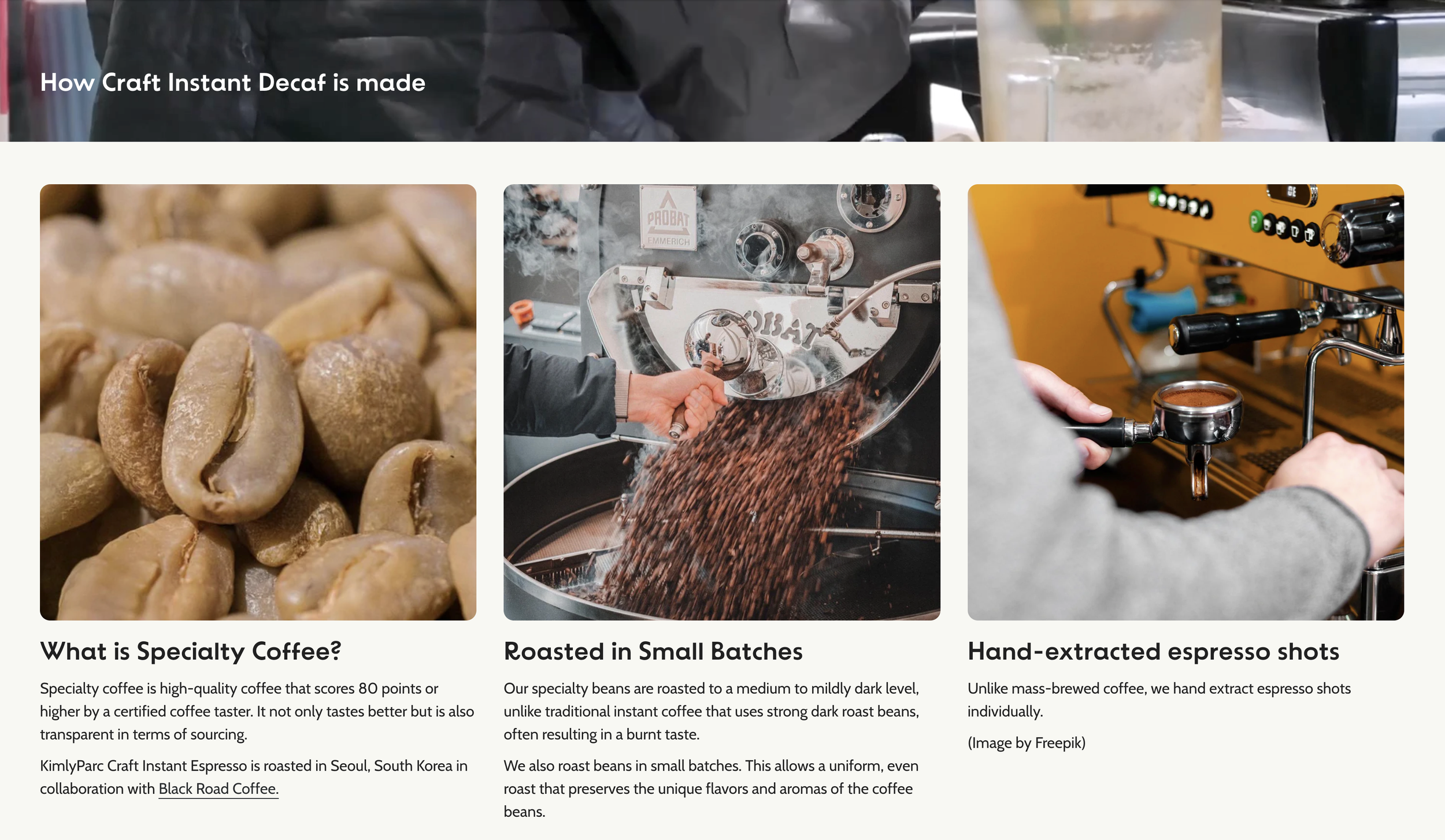
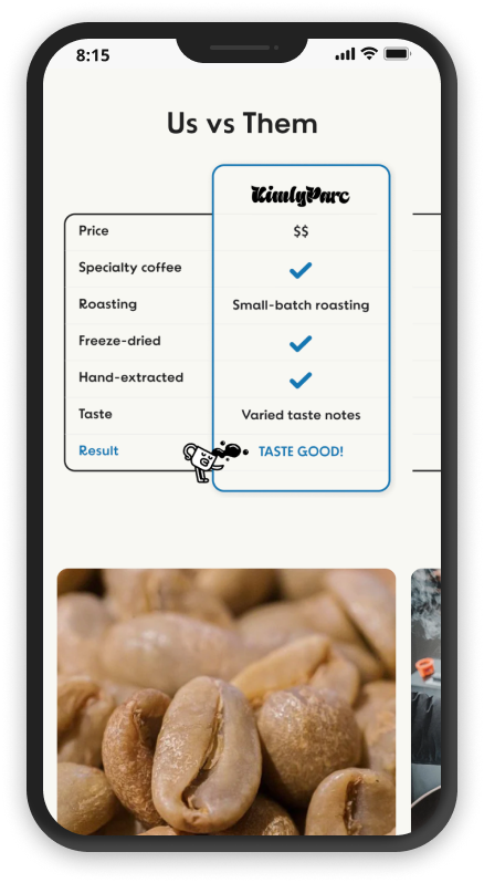
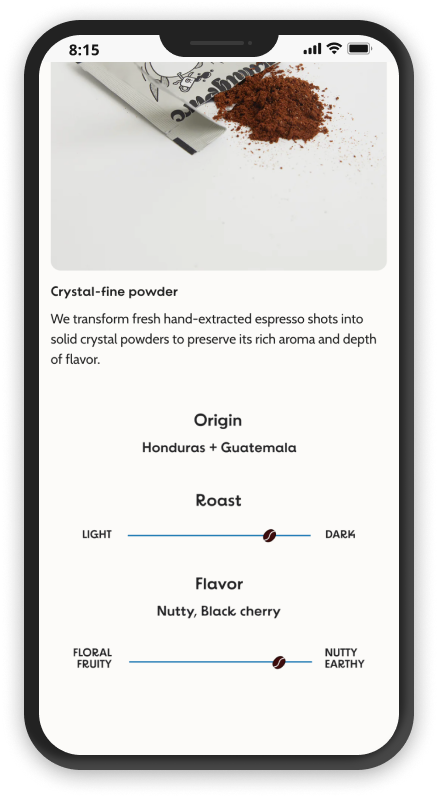
Craft Instant Espresso Page
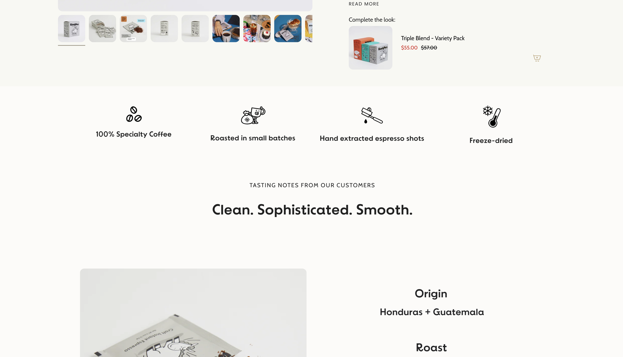
Craft Instant Espresso Page
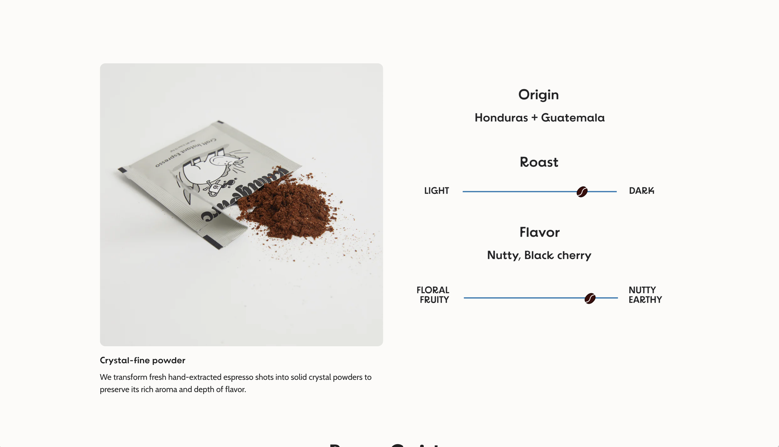
Craft Instant Espresso Page
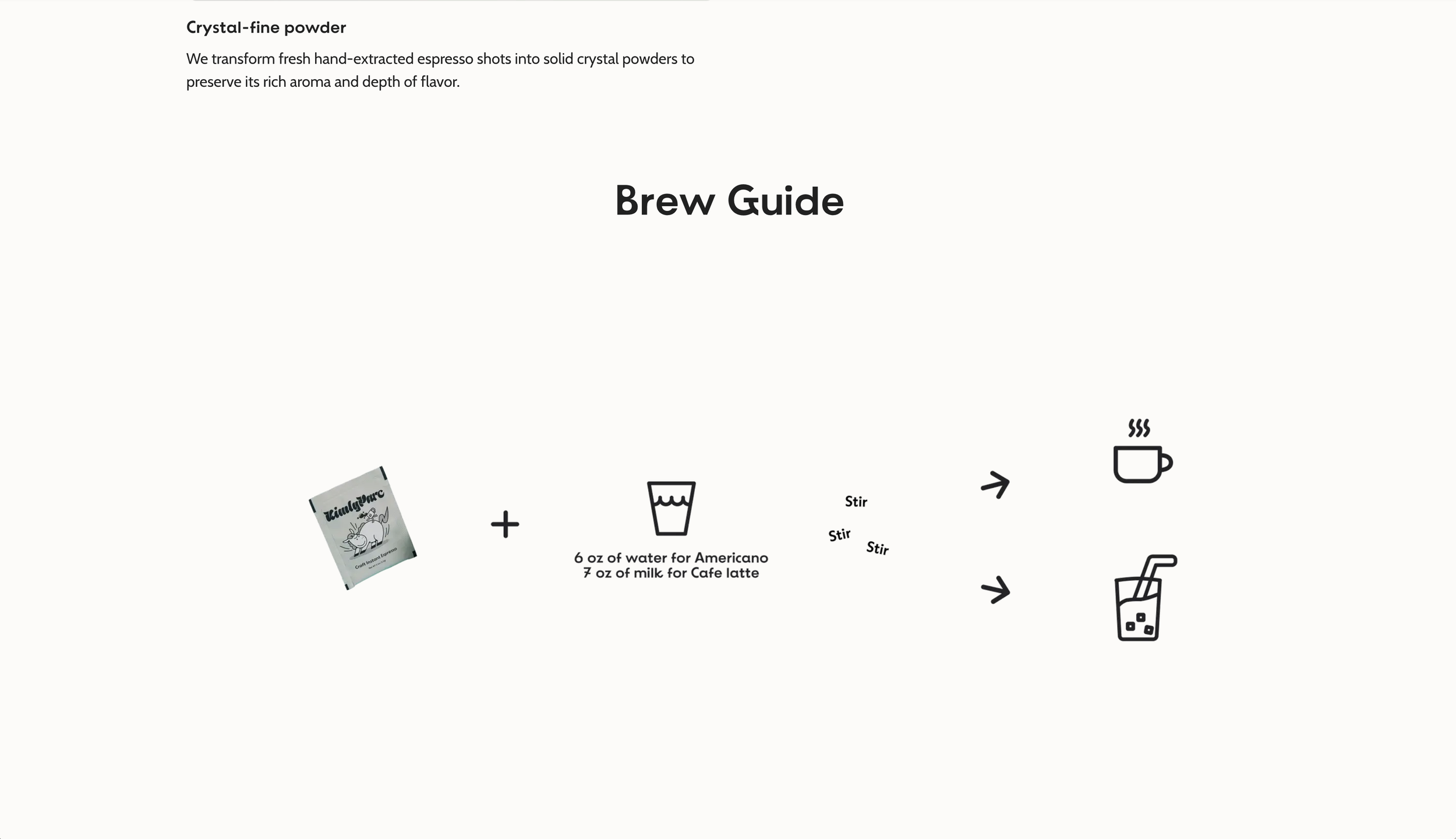
Craft Instant Espresso Page

Craft Instant Espresso Page
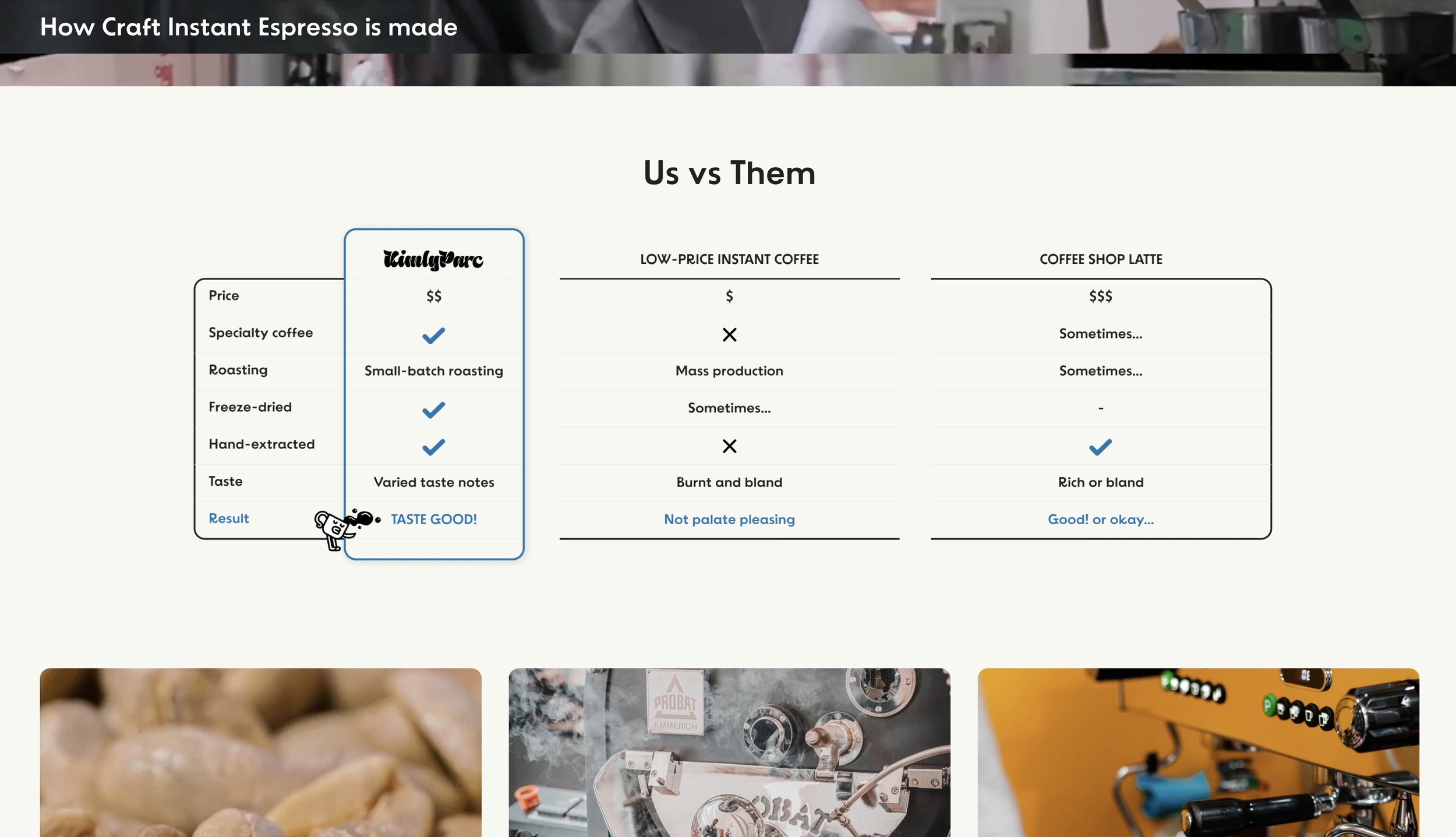
Craft Instant Espresso Page
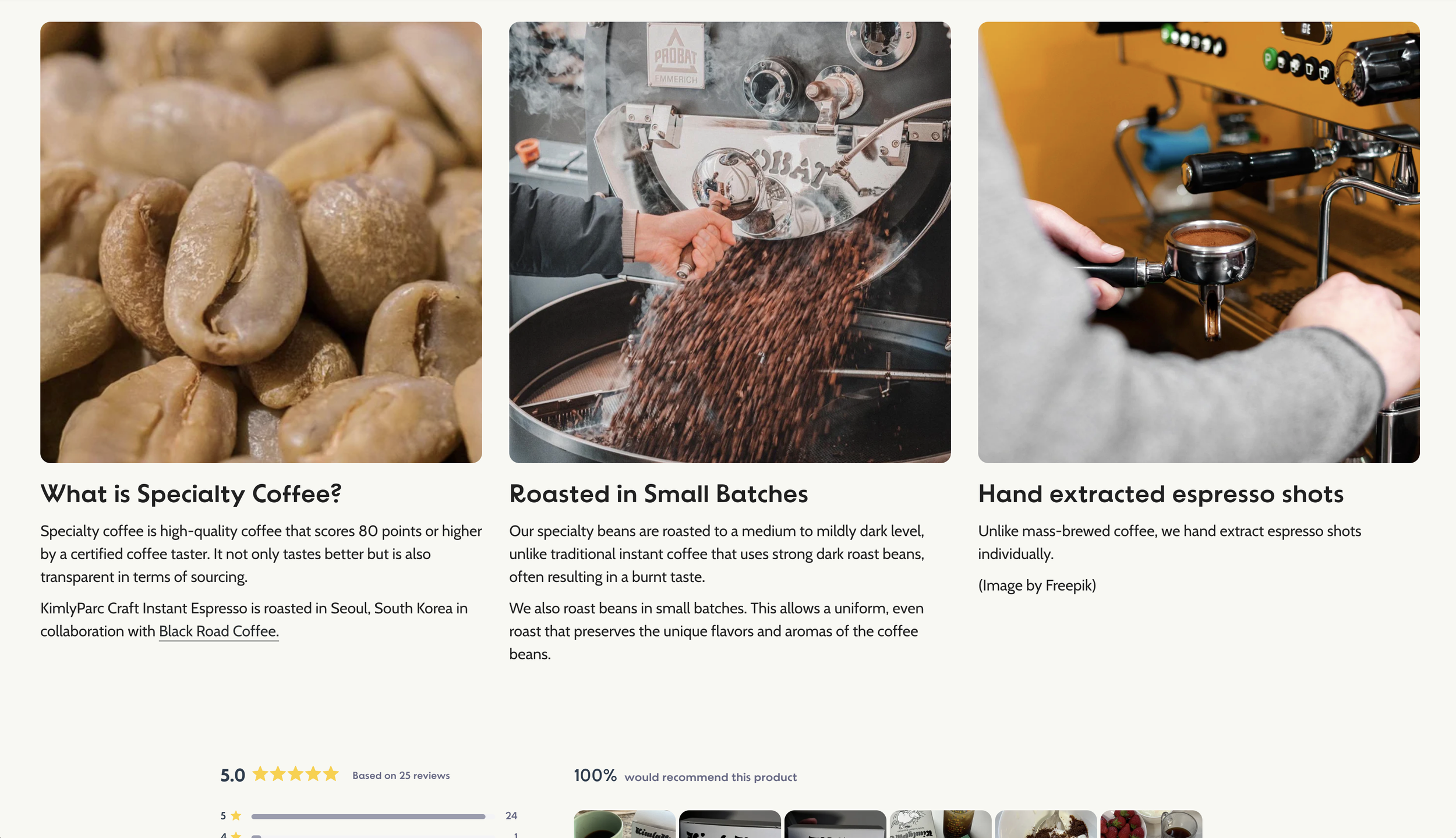
Craft Instant Espresso Page
Tailored for users seeking bold, barista-quality coffee at home, this page highlights the use of specialty beans and a meticulous production process—including small-batch roasting and freeze-drying. It reassures users that convenience doesn't mean compromising on quality. The clean, ingredient-focused layout features infographics, a competitive comparison chart, clear description of manufacturer with visuals, and emphasizes the product’s Korean originality—proudly produced in Korea—to showcase its distinct value.
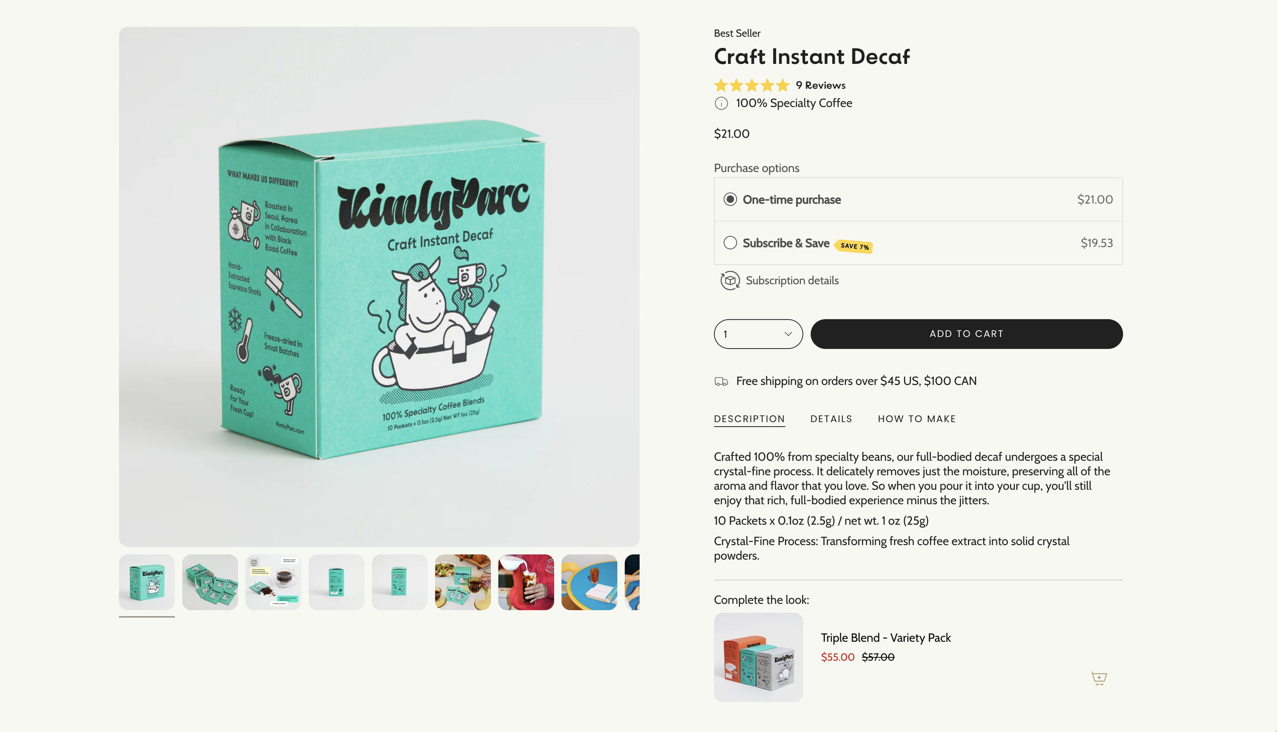
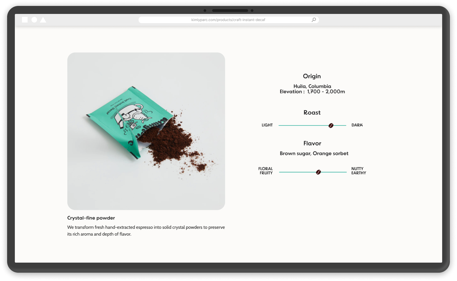
Craft Instant Decaf Page
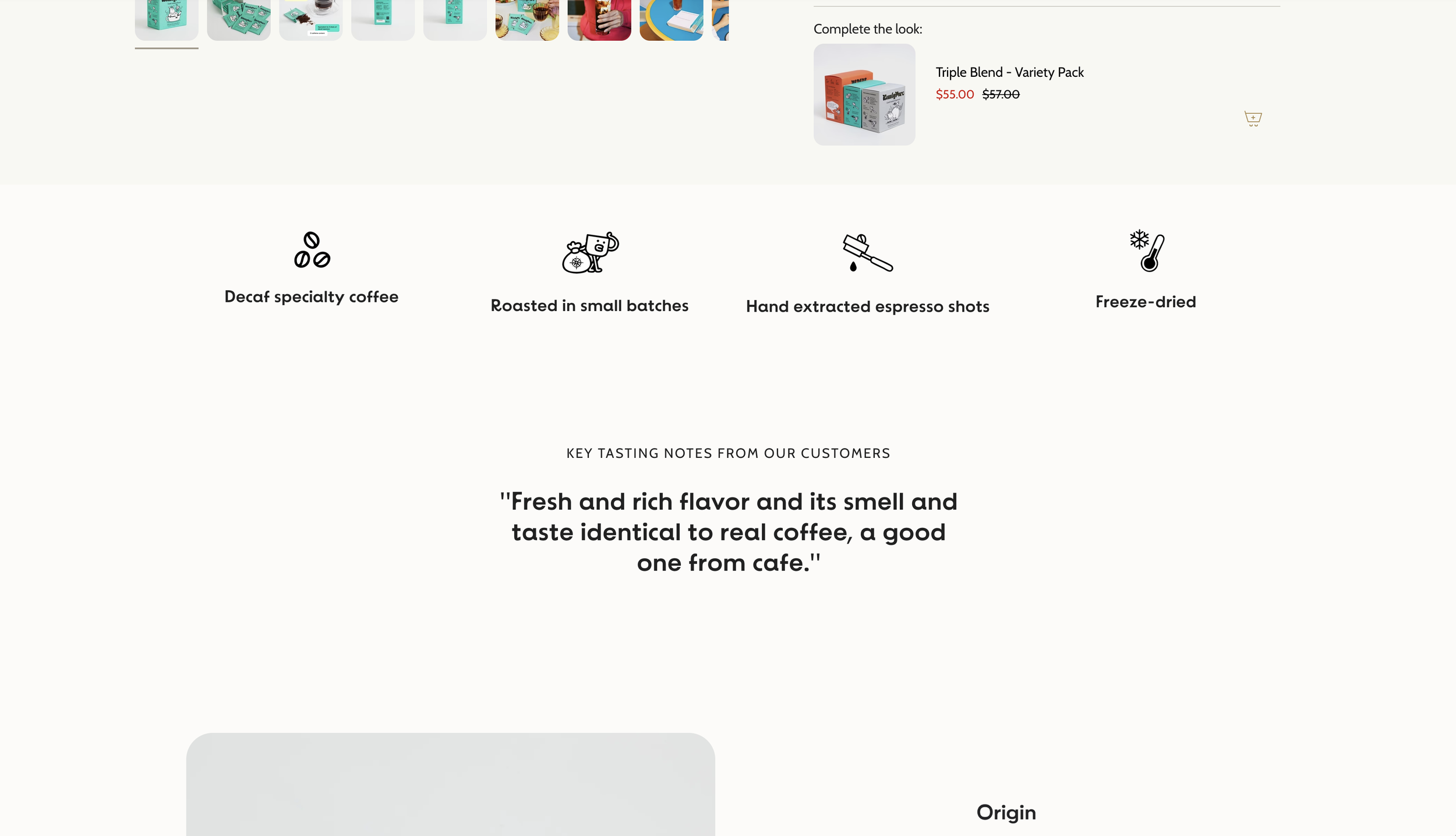
Craft Instant Decaf Page
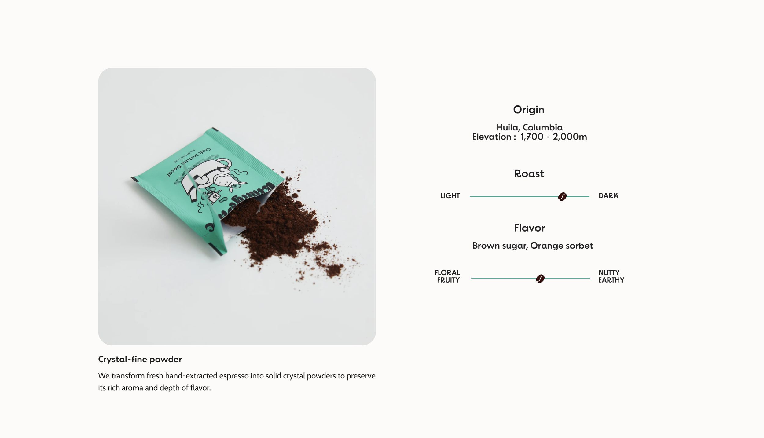
Craft Instant Decaf Page
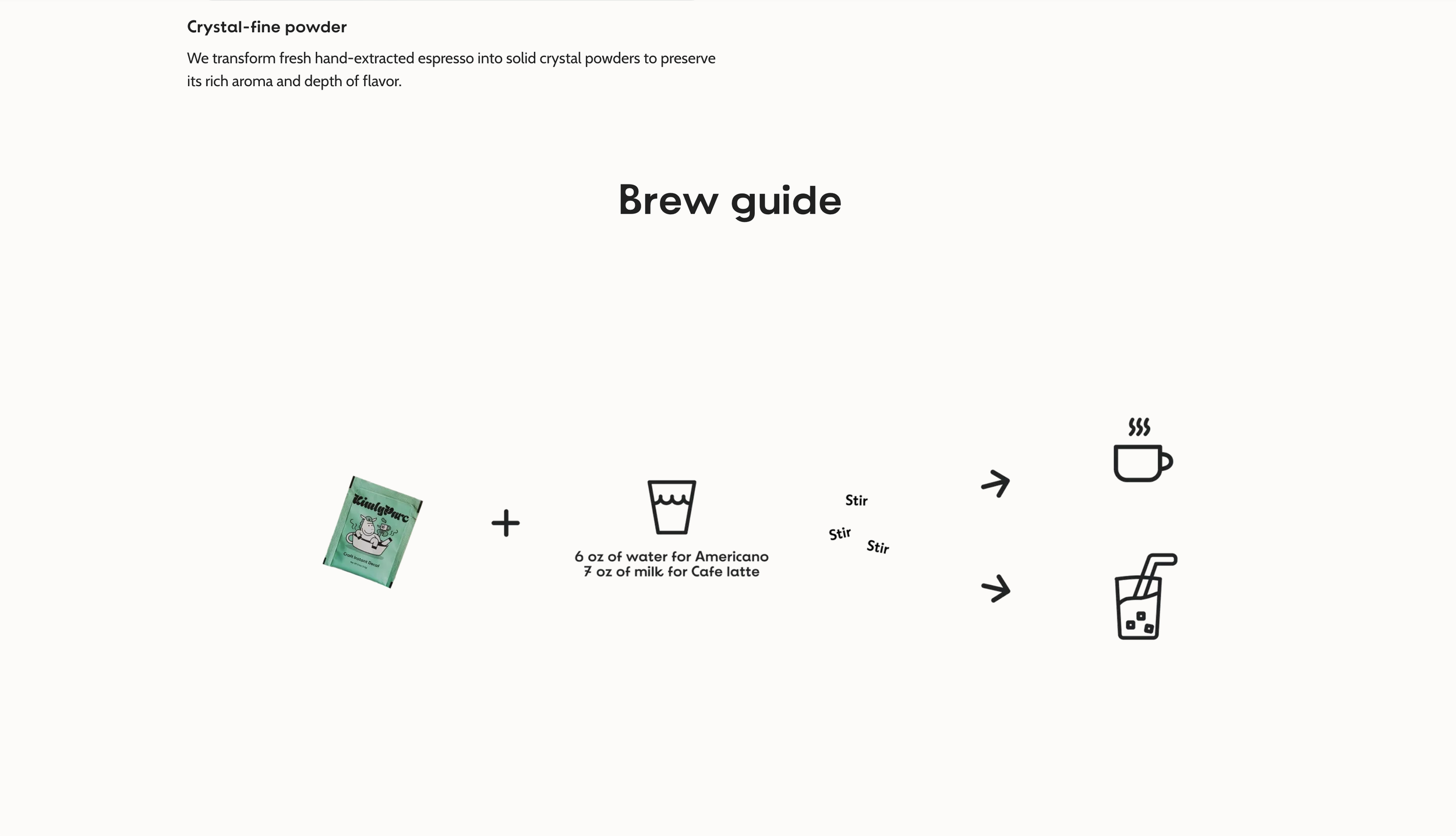
Craft Instant Decaf Page
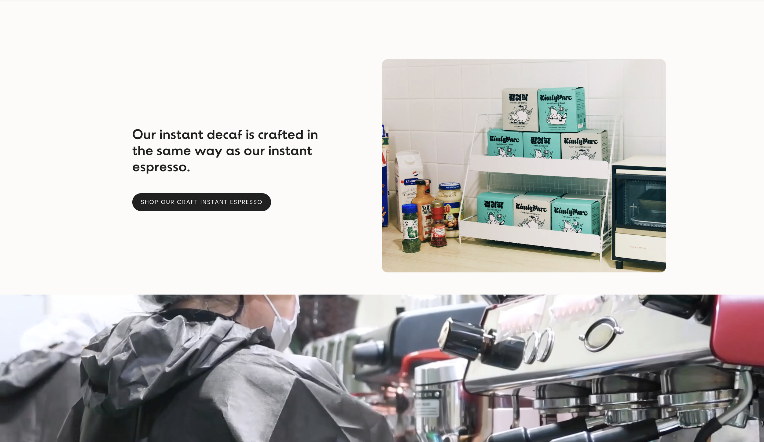
Craft Instant Decaf Page
Craft Instant Decaf Page
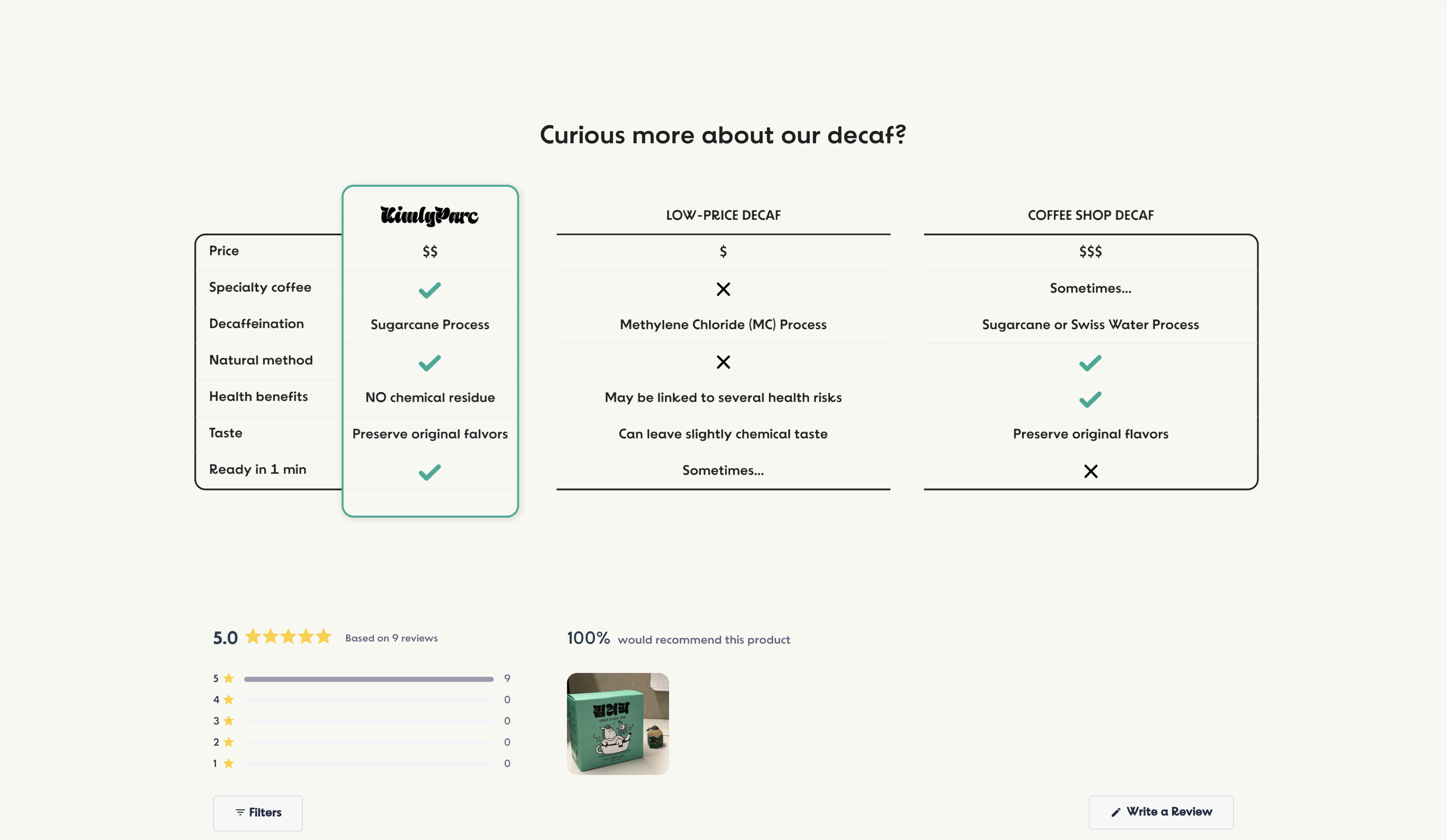
Craft Instant Decaf Page
Created to build trust in the taste and quality of decaf—often perceived as inferior—this page mirrors the structure of the espresso page. It emphasizes that the decaf is made using the same premium process and high-quality beans. A dedicated section explaining the decaffeination method is thoughtfully placed toward the end of the page, avoiding information overload while reinforcing the product’s transparency and reliability for users who care deeply about coffee quality.
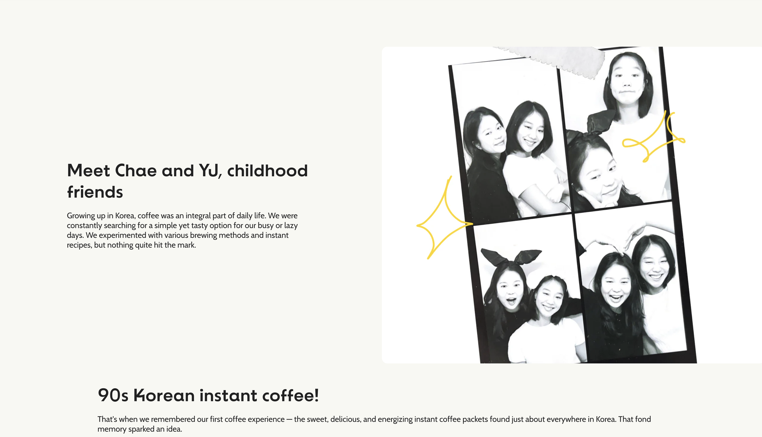
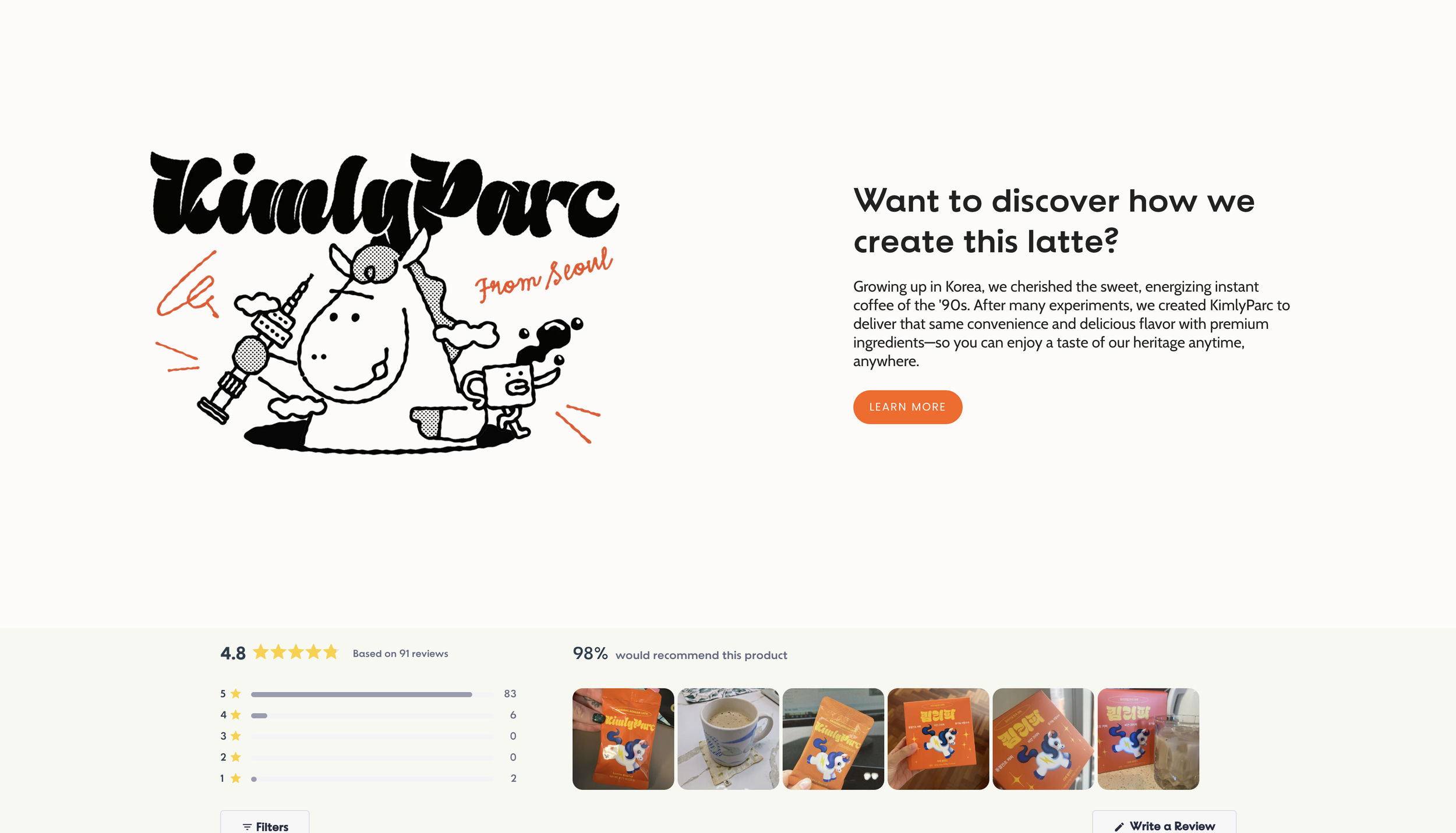
About Page
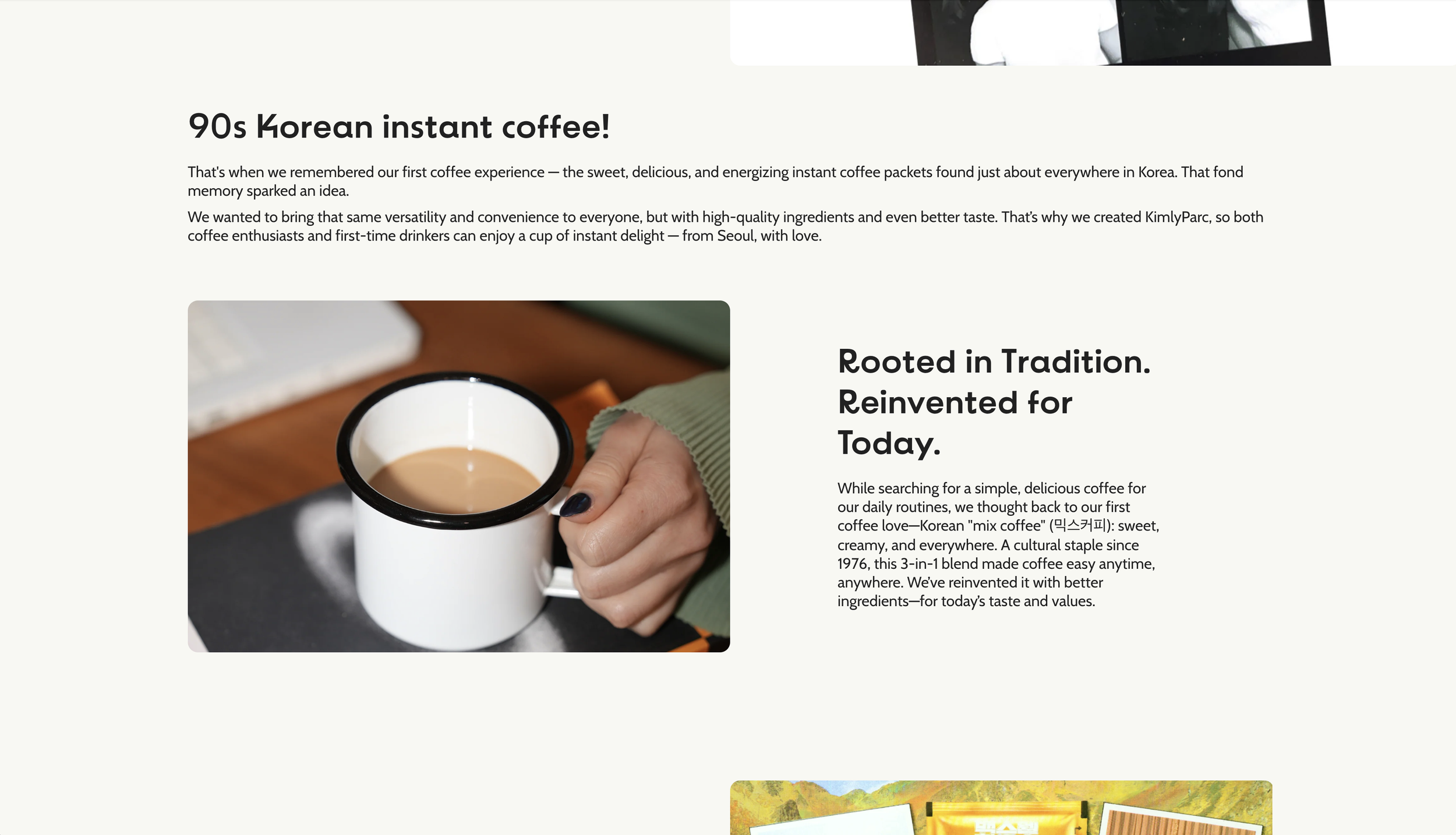
About Page

About Page

About Page
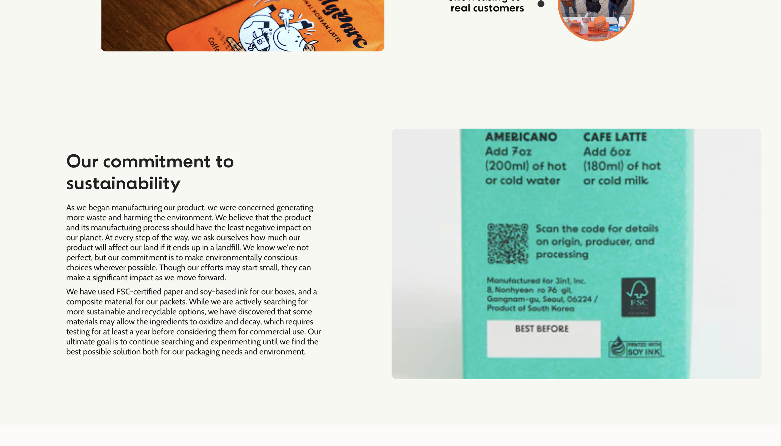
About Page
This page tells the origin story of KimlyParc—how childhood memories of Korean instant coffee inspired a premium coffee brand for modern, busy lifestyles. It also showcases the product development journey to create emotional connection and reinforce the brand’s authenticity, passion, and purpose.
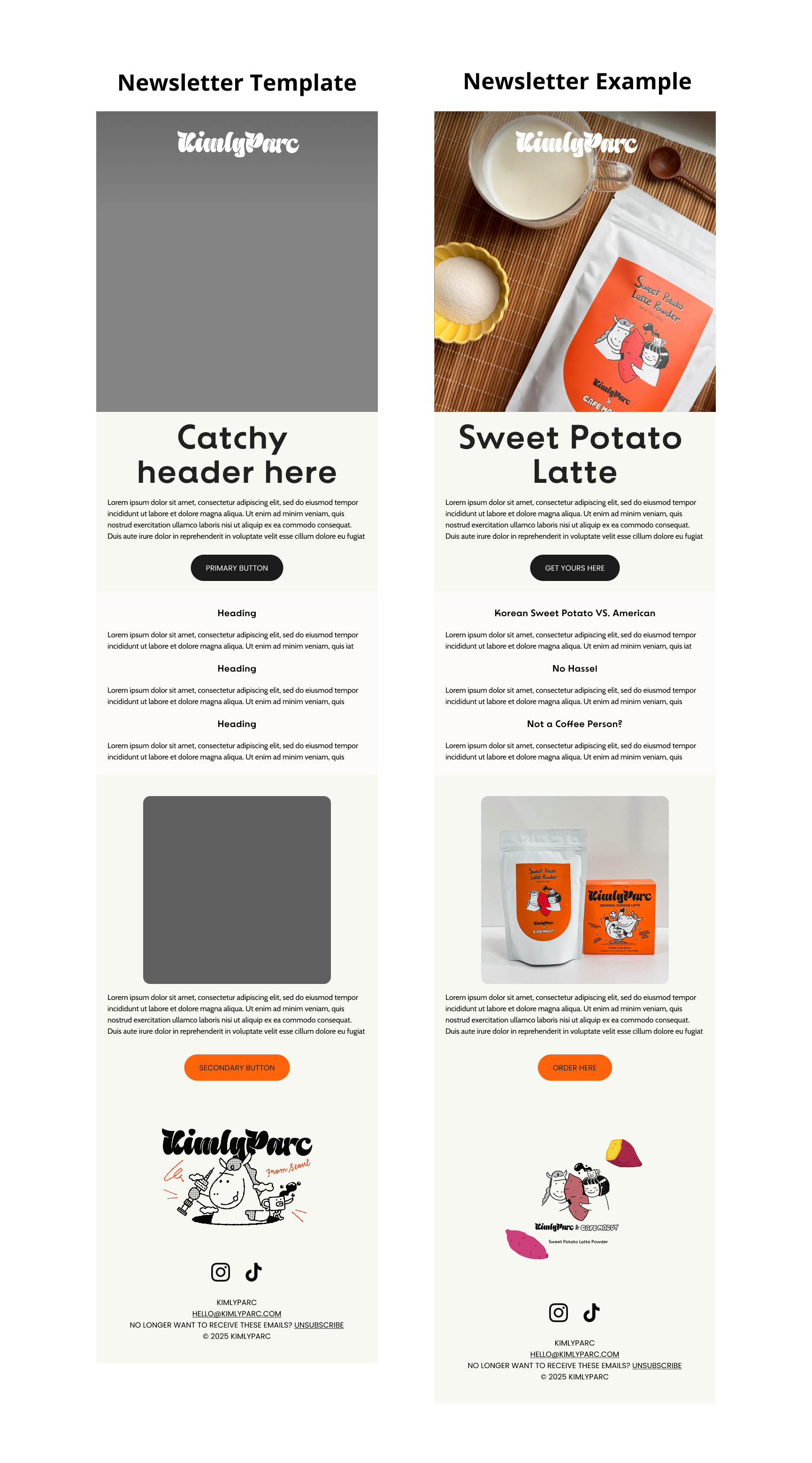
Newsletter Design
A branded, mobile-friendly newsletter template was designed to ensure consistent branding across marketing channels. The layout reflects the website’s visual language, with clearly organized sections for promotions, product highlights, and updates—optimized for quick reading, high engagement, and strong click-through rates.
Process
Research
Competitive analysis
User surveys synthesis
Website Audit
Define
Persona
Sitemap
User flow
Design & Testing
Lo-fi, Hi-fi, Prototype
Usability Testing
Research
Research was key to uncovering why users weren’t converting—unclear messaging, buried product benefits, and a lack of cultural storytelling. These insights guided a redesign that clarified value, built trust, and improved the user journey.
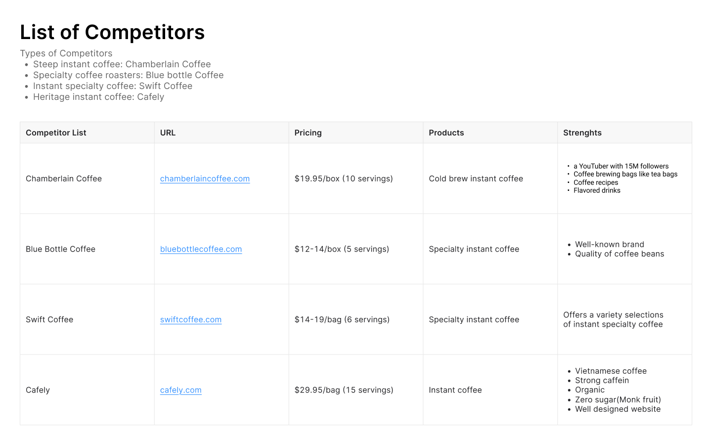
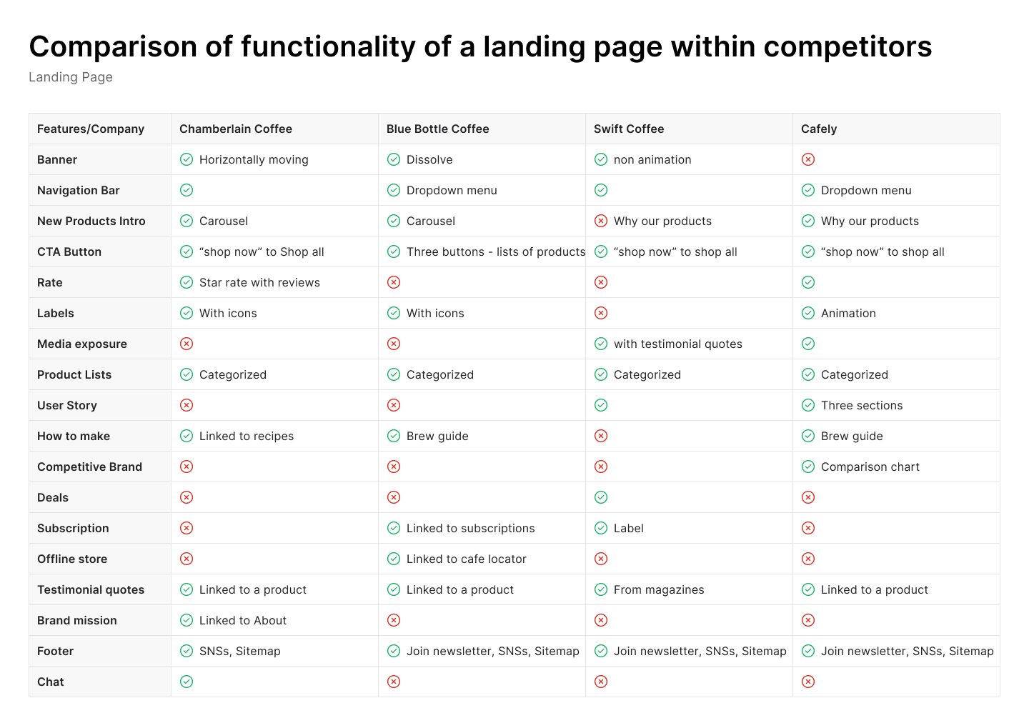
Competitive Analysis
I analyzed leading competitors in the specialty and instant coffee space—such as Chamberlain, Blue Bottle, Swift, and heritage-inspired brands like Cafely—to identify trends, value propositions, and gaps in product storytelling, visual presentation, and user experience.
User Survey Analysis

I reviewed and synthesized survey data previously collected by the client from existing customers. The goal was to extract insights into user motivations, preferences, and pain points.
Key insights
Users wanted clearer visibility into ingredients, health benefits, and the product’s origin.
Convenience, portability, and premium taste were top decision drivers—yet these were not clearly highlighted on the website.
Supporting data points
74% of users cared about healthy food options
70% preferred supporting small brands
81% discovered products through social media (especially Instagram)
48% showed interest in Korean culture, opening an opportunity to emphasize the product’s cultural roots
Anecdote
A standout realization was how underutilized the Korean coffee heritage was on the website. Many users expressed fondness for the nostalgic “mix coffee” experience, which—when highlighted—helped build emotional trust in the brand.
Website Audit
As part of the research, I conducted a detailed audit of the existing landing page and product detail pages to identify usability issues and alignment gaps between the site and the brand’s value proposition.
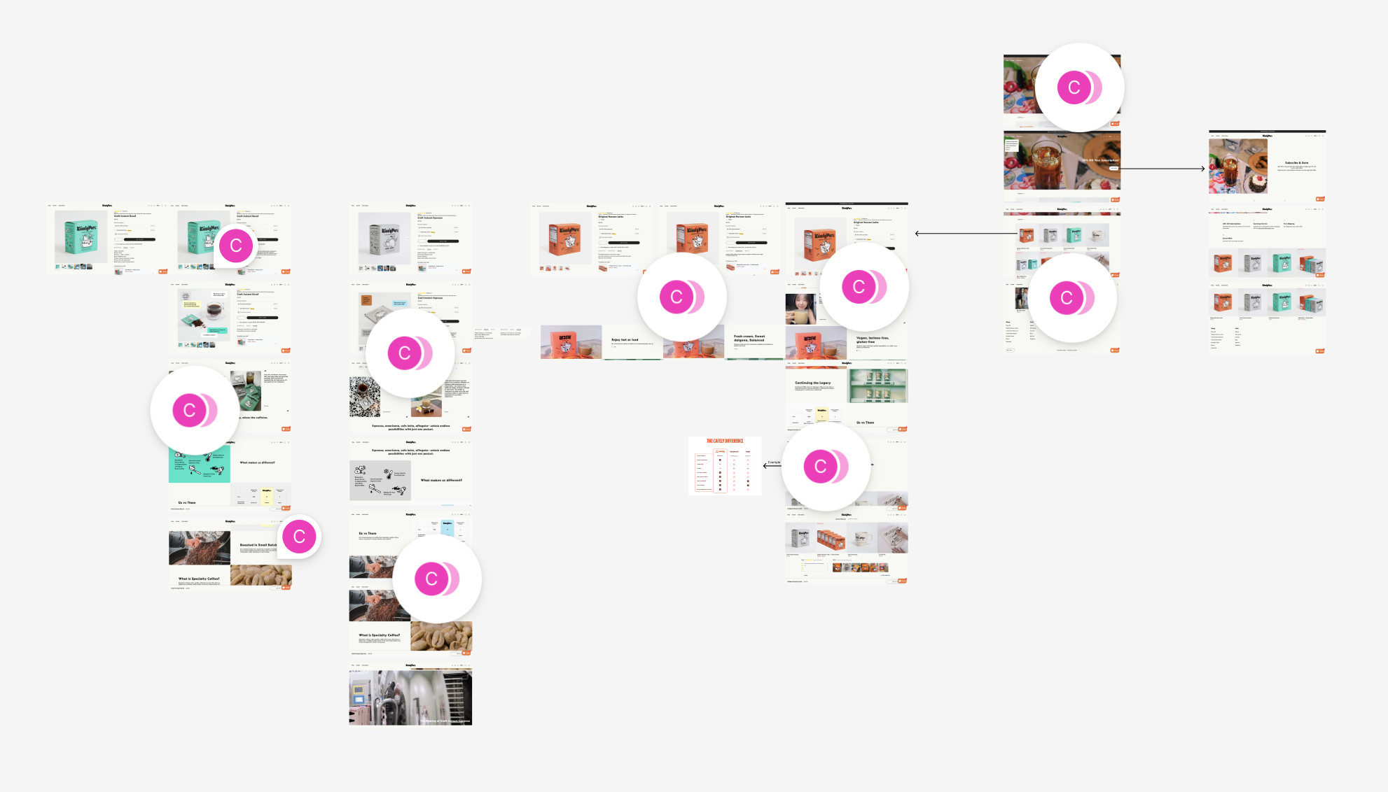
Website Audit on Figma
Key findings
Readability & Visual Hierarchy
Text size, color, and placement needed refinement to improve scanability. Infographics were lacking, and content was not grouped logically, making it harder to guide users through the site.Content Clarity
Product descriptions used terms that were unclear or undefined. The brand story and product strengths—such as health benefits, preparation ease, and ingredient quality—were buried or missing.User Flow & Navigation
The layout and order of content didn’t support a natural user journey. The landing page lacked strong engagement points, and product pages weren’t tailored to highlight specific benefits per item. CTAs needed to be more visible and action-driven.Additional Functionalities
Basic features like newsletter signup forms were missing, limiting user retention opportunities.
These combined research methods informed a design direction that prioritized clear storytelling, improved information flow, stronger branding, and better alignment with user motivations—setting the foundation for the redesign.
Define
Personas
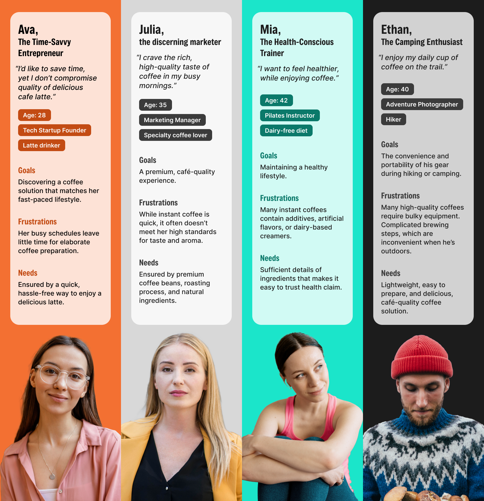
I developed user personas based on survey data and customer insights to represent key audience segments. These helped keep the design user-centered by aligning features and messaging with real user needs, behaviors, and motivations.
Project Goals

I defined clear business and user goals to ensure the redesign addressed both stakeholder objectives (e.g., increased conversion) and user expectations (e.g., clarity, ease of use, trust). These goals guided every design decision.

User Flows
Sitemap
I created a revised sitemap to organize content logically and support clear navigation. It includes the landing page with product overview and individual product pages (Latte, Espresso, Decaf).
I mapped user flows for key tasks like discovering products, understanding benefits, and completing purchases. This helped streamline navigation and create a frictionless, goal-oriented user journey.
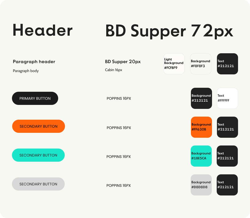
Design
Translating Brand Story into a Seamless, Responsive Experience
I transformed research insights into a clean, mobile-friendly design that communicates KimlyParc’s premium quality and cultural identity—through clear storytelling, thoughtful hierarchy, and cohesive branding across web and email.
I began with low-fidelity wireframes to explore content hierarchy and layout for the landing page and product pages (Latte, Espresso, and Decaf). These early versions were iterated based on usability goals and feedback. Once the structure was validated, I moved into high-fidelity mockups, applying the brand’s visual identity to create a polished, user-friendly experience. I also created product infographic to visually communicate features like ingredients, preparation, and benefits.
Iterated hi-fi wireframes on Figma
Responsive Design
With most users accessing the site via mobile (according to analytics), I designed fully responsive layouts for both desktop and mobile. The layouts were optimized for readability, ease of navigation, and strong visual impact across devices, ensuring users could explore and shop comfortably anytime, anywhere.

Testing & Iteration
Some users noted excessive scrolling, particularly on mobile, and mentioned that the content flow felt disjointed in places. There were also instances of redundant or overly detailed information, along with minor image sizing issues on smaller screens. These insights guided improvements to content structure, visual hierarchy, and mobile responsiveness.

To ensure the site was intuitive and conversion-focused, I conducted moderated usability testing using a clickable prototype of the landing and product pages. Testing focused on how easily users could find product details, understand preparation steps, and navigate toward purchase.
Conclusion
Summary
This project was more than just a website redesign—it was about communicating KimlyParc’s premium value and cultural story in a way that feels clear, engaging, and trustworthy. Through research-driven design, I created a responsive website and branded content that highlight the brand’s strengths and guide users toward confident purchasing decisions.
What I Learned
I learned how to translate complex product details (like freeze-drying, decaffeination, and ingredient quality) into digestible, user-friendly content. I also deepened my understanding of how to align visual storytelling with user motivations—especially when designing for both clarity and conversion.
Key Takeaways
I use UX as a strategic tool, not just for aesthetics but to drive business outcomes.
I bring together research, branding, and usability to create experiences that feel effortless and meaningful.
I’m comfortable working end-to-end, from research synthesis and storytelling to responsive UI design and testing.
Next Step
To continue improving the KimlyParc experience, I would:
Track post-launch performance using analytics (e.g., conversions, bounce rate).
Iterate based on real user behavior.
Expand the design system for future product lines or subscription models.
Explore A/B testing and personalization strategies to further enhance engagement.