Connecting retired professionals
with people seeking expert guidance,
enabling purposeful, valued mentorship across generations
End to end product design / Mobile / 100 hours / May 2025


PROBLEM
A missed opportunity for mutual value
Startups and independent creators often need affordable, trustworthy guidance, but traditional consulting is too expensive and inaccessible. At the same time, many retired professionals are eager to stay active and contribute their expertise - especially when they feel useful and valued. Despite this opportunity for mutual benefit, there’s no simple, accessible way for the two groups to connect.
WHY RETIRED PROFESSIONALS?
👵
🧓
According to the UN, by 2050, 21.5% of the global population will be 60+,
that is 2.1 billion
1 in 3 of older adults report feeling lonely
🧑🦳
👨🦳
😔
😔
54% of workers aged 66+
have desire to stay mentally active and
seek opportunities to remain productive and useful
“It was very difficult during the first year of my retirement because I didn’t know what I can do, who I can call, who I can talk to all of sudden”.
- 64 year old retired adult
“Having a mentor for professional help was very helpful to learn, overcome obstacles.”
- 37 year old working adult
SOLUTION
A user-friendly,
age-inclusive platform
By positioning retirees as a trusted, underutilized resource, my design centers on making the connection simple, respectful, and empowering for the older adults —while giving people who seek advice easy access to reliable, one-on-one guidance.
01
Simplicity with streamlined tasks

-
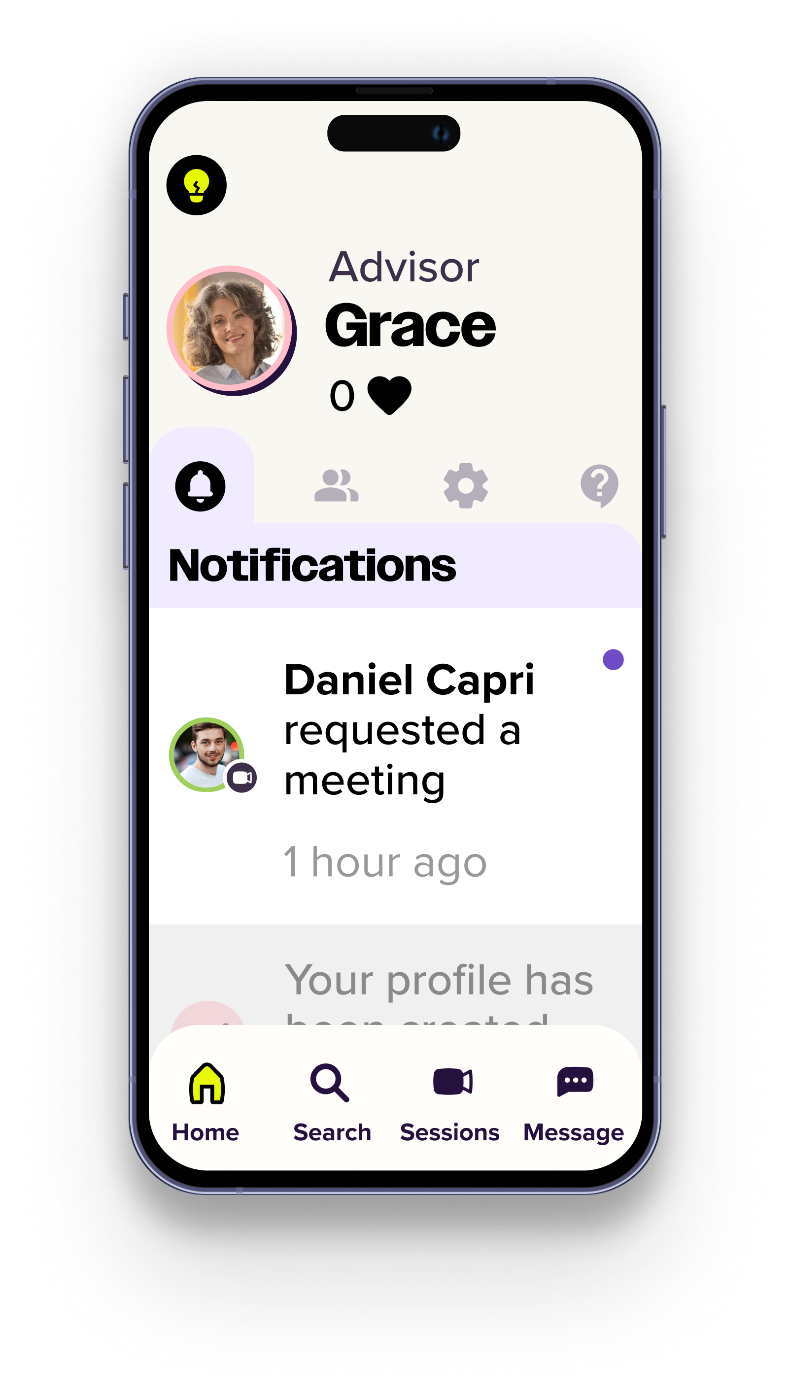
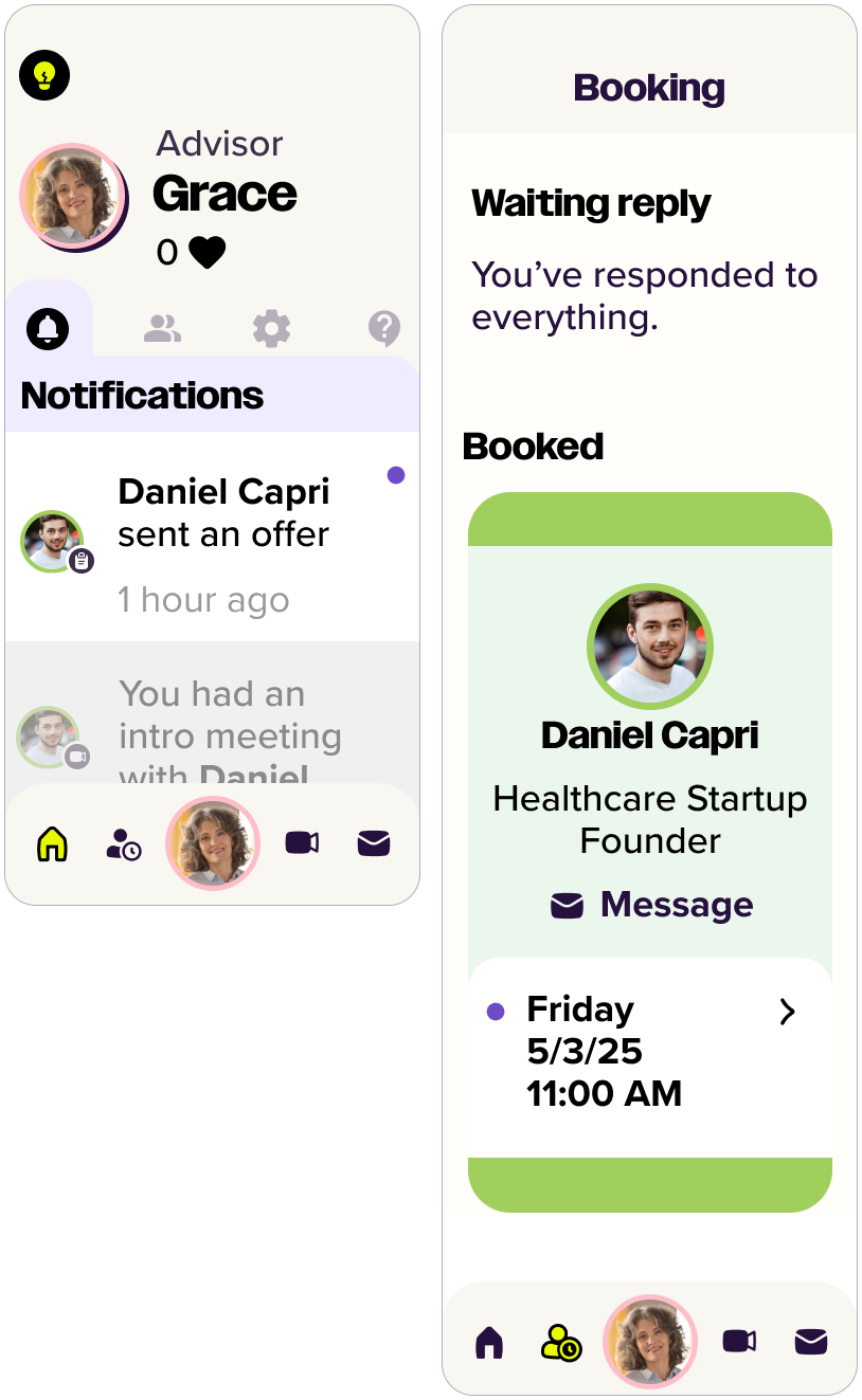
The dashboard opens with a timeline-based notification feed, so users can quickly see upcoming tasks or messages and act with a single tap. This reduces cognitive load and makes navigation intuitive.
-
In the sessions menu, upcoming meetings display a video icon that connects users straight to their meeting platform - no extra steps, no app switching.
02
Easy scheduling, comfortable conversations
-
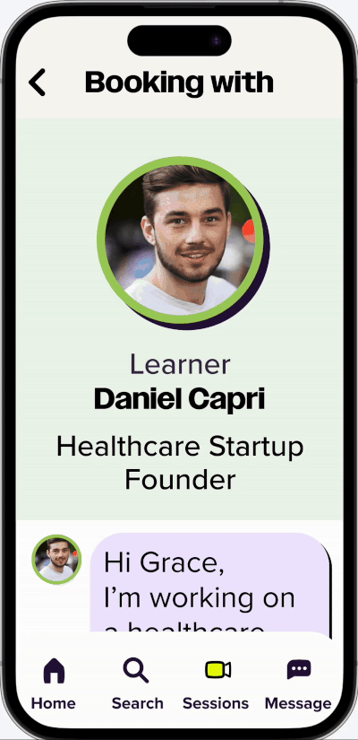
Booking a session feels as natural as sending a message. Instead of juggling apps or tools, Advisors and learners use one familiar thread to chat, suggest times, and confirm meetings. The flow is simple, intuitive, and designed so even those with limited technical skills - like many in the 60+ group - can feel confident and supported.
This approach fosters mutual respect and ongoing connection. The platform lowers barriers, reduces friction, and keeps both sides engaged with minimal effort.
03
Empowering older adults


-
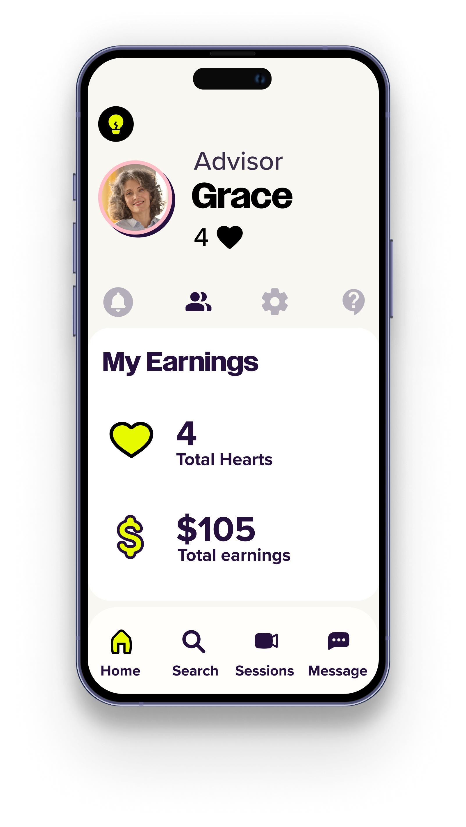
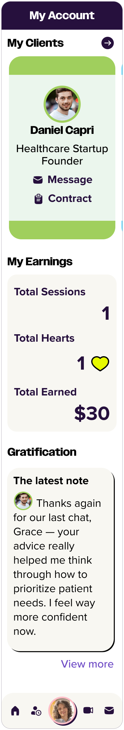
Retirees’ contributions are recognized through both monetary compensation and symbolic rewards. Advisors receive “heart points” and thank-you notes from clients, reinforcing their value and fostering a sense of purpose.
-
Older users with physical limitations can easily enable accessibility options in the app, such as adjustable text size and a dictation tool that converts speech into text using a microphone and speech recognition.
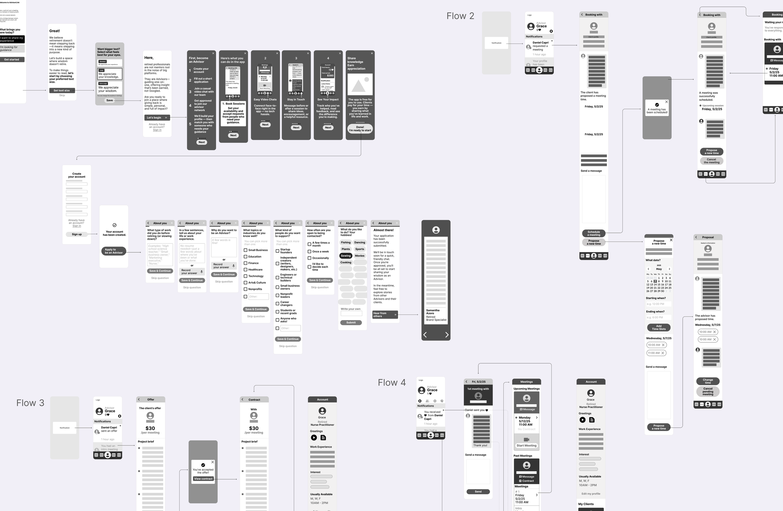
Get to know AdvisorLink
Scenario
I designed the product through a scenario-based approach, framing how it fits real-life situations and motivations of both user groups - retirees and advice seekers
Prototype
Explore and interact with the design to see how it works
Process
RESEARCH
Competitive Analysis
1:1 User Interview
DEFINE
Persona
Sitemap
DESIGN & TESTING
User Flow
Lo-fi Prototype
Hi-fi Prototype
Usability Testing
HAND OFF
UX RESEARCH
What users need
Mutual respect, access, and purpose are key to meaningful intergenerational connection.
COMPETITORS ANALYSIS
Competitors are too professionally formal, too socially casual, or lack age-inclusive, accessible design.
FEATURES ANALYSIS
1:1 USER INTERVIEWS
Both retirees and young people seek respectful, low-pressure connections.
Discovered what are proven features or patterns worth adopting or improving.
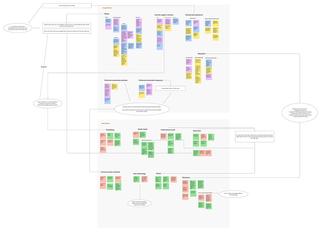
AFFINITY MAP
The design should offer valued opportunities, integrate simple and accessible features, and cultivate trusted, story-rich exchanges.
DEFINE
Mentor-first design philosophy
For this project, I made a strategic choice to prioritize retired professionals—the mentors/advisors—as the primary users. While most mentorship platforms are mentee-centric, AdvisorLink flips the model to serve the “supply side” first. Without engaged, credible mentors, the platform holds no value for mentees.
Personas
To bridge intergenerational communication between younger individuals and retired older adults, I treated each as a distinct user group, as they engage with the product in very different ways.
Sitemap
Straightforward navigation structure tailored to retirees is needed for the ease of use and accessibility.
User flows
I focused on intuitive onboarding, simplified tasks flows, and emotionally meaningful interactions.
DESIGN
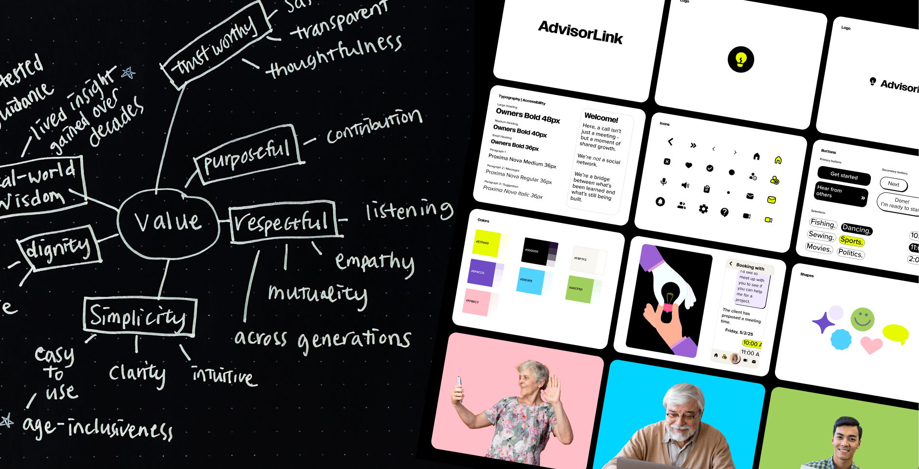
Discover how design evolves
Built the product’s visual and functional foundation—from lo-fi wireframes to branding to hi-fi deliverables.

Testing & Iteration
Usability testing insights
I tested the prototype with five target users, evaluating visual design, interaction patterns, and accessibility. While participants navigated low-fi flows easily, testing the interactive prototype revealed unclear button labels, overlooked elements, and confusion about the app’s purpose and onboarding—issues not apparent in static screens.
Iteration Priority 1: Improve navigation clarity
Redesigned the navigation bar with clearer iconography and labels.
Old Design
Old Design
New Design

Iteration Priority 2: Clarify messaging system
Made messaging booking flow more intuitive.
Old Design

New Design
Iteration Priority 3: Add a dedicated dashboard
Included an easily accessible dashboard on the home screen
New Design

Removed the overlooked account icon from the navigation bar, allowing users to acess the ‘My Account’ page via their avatar icon on the dashboard instead.
Renamed for clear status labels, and reordered the list so upcoming sessions appear first, prioritizing the most relevant information for users.
Removed “Bookings” icon(a person with a clock) from the navigation bar and embeded the booking feature on Sessions page led from Sessions icon(video call icon).
Moved ‘Cancel the meeting’ to the Schedules section on the dashboard, making it easier for users to change or cancel upcoming sessions.
Moved ‘Propose a new time’ button to the guide and reworded it as ‘request your time here.’
Changed ‘Schedule a meeting’ to ‘send’ for users to understand that they need to send their message with time selection.
Removed the carousel, which users often overlooked, and moved the client list to the expanded dashboard menu.
Each client avatar now opens a profile card with options to view profile, view contract, book a session, and a message, view session history, view thank-you notes.
Conclusion
Summary
AdvisorLink is a micro-consulting platform that bridges generations by connecting retirees with valuable expertise to younger creators and professionals who seek real-world guidance. The project demonstrates how thoughtful design can unlock untapped potential in both groups, resulting in mutual value.
Design lessons learned
Inclusive. Impactful. Human.
I learned how to design meaningful connections between very different user groups through inclusive research, clear UX, and thoughtful interaction design. By addressing both senior advisors and younger users, I learned to develop parallel design solutions tailored to their specific needs and preferences.
Turning social needs into product opportunities
I also gained experience turning social needs into viable product opportunities—designing a platform that not only solves a real-world problem, but creates mutual value and potential for revenue. This taught me how to build purpose-driven products that are both user-centered and business-minded.
Takeaways from the project

Lead a full end-to-end UX process, from research to final design

Translate social challenges into strategic, revenue-generating opportunities
Conduct inclusive user research across diverse age groups and roles
Solve problems with both empathy and business-minded thinking
Design parallel experiences tailored to different user needs on the same platform

Deliver accessible, emotionally resonant, and purpose-driven design
Next Step
Develop a desktop version for more professional use.
Refine the business model—ensuring the pricing, booking, and payment experience is transparent, simple, and aligned with their goals and expectations.
Next Project
KimlyParc
Communicate its premium coffee story
